Welcome to (The Occasional) Photo Tip of the Day! Please also visit my main site jeffwignall.com. Text and photographs Copyright 2016 Jeff Wignall.


“The best way out is always through.”


Sunday, May 31, 2009

Look Up!

Most of the time when we're out shooting pictures we look at the world that's in front of us from eye level. We look straight ahead, occasionally turning our head to see what's off to the side. For some reason though, most of us rarely look up unless there's something interesting happening in the sky--a airplane flying over or a pretty cloud passing by, for example. But there are a lot of times when the best photos are directly overhead and the only way to find them is to occasionally look up--straight up. That's exactly how I found this shot of a beautiful old live oak tree draped in Spanish moss.

I made the shot on the grounds of the Marjorie Kinnan Rawlings Historic State Park near Ocala, Florida. Rawlings wrote The Yearling and the house she wrote it in is preserved at the park--a great Florida side trip. Nearby the Rawlings' homestead there's a small picnic area at the edge of a lake with lots of beautiful old live oak trees. I spent an hour or so (between bites of lunch) looking for a good shot of Spanish moss because it's always been a frustration to me that, despite having spent a lot of time traveling in the south, I didn't have a good Spanish moss shot. As some point while I was shooting views looking "at" the trees, I laid down on the grass next to one--and there was the shot I'd been waiting for. Here was a perfect silhouette of this rugged live oak completely decorated with Spanish moss. The bright Florida sun shining through the moss was making it glow like backlit hair.

I spent another half an hour or so shooting various compositions looking almost straight up and and while it was a pain in the neck (literally) to get my tripod to point up that sharply, I really had a good time taking the pictures. I used matrix metering to meter the shot and added a stop-and-a-third of exposure compensation to keep the highlights in the moss bright. It's a tricky bit of exposure to try and get a silhouette and keep detail in backlit highlights at the same time and I give a lot of credit to the meter in my Nikon D70s (then the newest camera I had--I'm not sure I trust the meter in my D90 quite as much today).

Next time you're out shooting, look straight up and see what's up there. City buildings, tall trees, lamp posts--they all look pretty interesting from that extreme angle.

Saturday, May 30, 2009

Ignore the Rules & Press the Button

I'm sure it's reflective of my larger personality, but I have to admit I'm a quality control freak when it comes to taking pictures. I almost always use a tripod (more about that in an upcoming post), I always meter carefully and I think a lot about the camera settings. But for the fuzzy, ill-composed shot here, I didn't think about any of that: I just pressed the button when the moment happened and I didn't have any idea what the camera settings were.

The kitty in this picture just arrived in my house about 8 weeks ago and prior to that she had led a feral life for more than four years. She was born outside and survived by her wits, cunning, speed, elusiveness and hunting ability. She was "tamed" somewhat by my friend Lynne, but Lynne already had two cats so Mama Kitty ended up living with me (and my other cat, who is her daughter--are you following this?). Anyway, she's an extraordinarily sweet, but very shy cat and though she's a wonderful pet, she is still very cautious around me. If I move quickly, she dashes off to another room in a cloud of dust (leaving a trail of claw marks in my beautiful hardwood floors!).

I took this photo a few days ago when I was just sitting on the porch and cleaning my camera. I had no intention of taking any pictures but then I looked down and saw that I was being spied on by this very curious cat. This kitty is so fast and so elusive that I knew if I paused to set the right shutter speed or turn on the flash, she'd be gone. So before she could move a whisker, I just pressed the button. The photo is badly composed, nowhere near sharp (it was shot handheld at 1/8 second--something I'd never knowingly do), the white balance is all wrong and the shot is full of clutter--but I love it. This is my first shot of my new model and she created the idea for it by watching me; she told me it was time to start photographing her. And so I did.

Sometimes a shot will happen so quickly (with kids, pets, animals) that you have to shoot first and think later. In these situations it's more important that you capture the moment and save the finesse for another time. The curious look on this sweet cat's face is far more important to me than a sharp photo.

Friday, May 29, 2009

Visit Maine During Lupine Season

One of the most spectacular wildflower displays anywhere in the world happens each June all over the state of Maine when the beautiful lupines come into bloom. If you've never seen the lupines in bloom, it's an amazing site: you come around a corner on a country road and suddenly dozens of acres are filled with purple, blue and pink stalks reaching upwards of five or six feet tall.

I have to confess to having spent a lot of frustrating hours over the years trying to get a good photo of the lupines and it's tougher than it looks. I was in a spectacular field in Rangeley, Maine one summer and got so frustrated at not being able to find a shot that I came close to tossing a camera into the woods. It can really make you nuts to have what looks like millions of flowers in front of you and not be able to find a single good shot.

Getting a good shot is actually a true test of your ability to see creatively. One of the first decisions you'll have to make is whether to shoot just a few blossoms or try to take in an entire meadow. Remember that you don't have to include every flower stalk that you see in order to impart the feeling of endless blossoms. Often it's better to find a small group of flowers and contrast them against a plain background (try to use a dark background like the pine trees in the shot here). Experiment with different lenses or zoom settings, too. I find that a medium telephoto setting is a good way to isolate a small grove of plants, but a wide-angle lens will let you exaggerate the depth of a long field full of flowers.

If you're really serious about getting a good shot of a broad field, consider bringing a small step ladder with you. Just getting an extra two or three feet of height above the field is enough to get a really unique and interesting perspective. The great landscape master Ansel Adams had special shooting platforms built on top of his vans for that very reason.

Lighting is also very important in shooting the lupines: early morning and later in the afternoon when the light is soft and less contrasty is ideal. I actually like working on cloudy days because the flower colors are more saturated and there are no glaring highlights. One other slight problem I run into when shooting lupines is wind--on windy days you either have to include some motion (intentionally using a show shutter speed) or just wait for a calmer part of the day.

All of these considerations will race through your mind when you spot your first big field of lupines, so I suggest that when you find one good field in full bloom, slow down and spend a few hours there looking for good shots and experimenting with different ideas. And boy, has writing this tip made me want to get out the Maine maps!

Thursday, May 28, 2009

Get Extreme with Cropping

Most of us are so used to seeing photos in traditional sizes (5x7, 8x10, etc.) that we are somewhat fearful of cropping images in more radical ways. I think part of the fear is that we imagine other people will wonder if we were just trying to save a bad photograph by giving it an extreme haircut. But so what? If you can take a mediocre photograph and make it a great one by cropping it, then go for it. Besides, other people only notice what's good about a photo, they're not even aware of what you did to make it work.

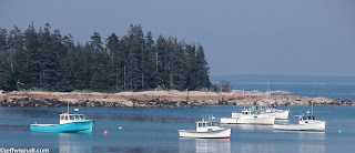
I shot this row of fishing boats in Stonington, Maine and the camera I had with me just didn't have a long enough lens to create the shot I wanted, with the boats in the immediate foreground (I was using an Olympus C5050 back then--one of my favorite cameras of all time). I shot the photo anyway, using a long expanse of harbor as a foreground. But when I looked at the photo in full frame, the boats just seemed lost, it didn't look like I had a plan for the photo at all--so I set the photo aside for a long time. Then a few nights ago I was going through my Stonington folders and I decided to try and rescue the shot by cropping it into a near panoramic format. (I do that a lot, by the way, revisiting photos a year or more later to see if my editing knowledge and skills have improved enough to revive "lost" photo ops.) I think the long horizontal frame really accents the long island and the row of boats nicely and since I didn't blow the photo up to crop it, just removed the foreground, the quality of the long narrow shot is just fine.

Don't be afraid to crop your images to unusual sizes, often just changing the framing a bit can save an otherwise dull photo--or make a good one better.

Wednesday, May 27, 2009

Say Goodbye to Times Square Traffic Shots

If you've always wanted to photograph streaks of traffic whirring through Times Square in New York, you've missed your chance: the city has announced that the stretch of Broadway from 42nd Street to 47th Street is now a pedestrians-only mall. Personally I'll miss the colorful and chaotic parade of traffic winding (sometimes whipping) through Times Square, but I'll feel much safer not having to dodge cabs and SUV's when I'm shooting.

So if you have any old photos of traffic in that area, they're historic now so take good care of them! Hopefully having the traffic gone will make it easier to photograph the ever-growing glitter of the Neon Canyon--and without breathing all of those emissions!

Tuesday, May 26, 2009

Critique Thyself...but Cut Yourself Some Slack

Like most photographers (or artists of any kind) I'm intensely self-critical. I pretty much hate when other people criticize my photos, but I'm merciless when it comes to analyzing what went right or wrong with my own pictures. Interestingly enough, I'm often much more positive and encouraging when I critique other people's photos. When I taught online regularly, for example, I would often spend an hour writing a 500-1,000 word critique of my students' work and always looked for the positive and creative aspects of their photos. I found that students grew faster and appreciated my comments more if I focused on the good things they had done.

Still, when I first download my own images, I hammer myself for all of the mistakes that I made or the better ideas that I probably overlooked. The photo here is just a snapshot. I was waiting for a freighter to leave the harbor and this couple walked into the frame so I shot a quick dozen photos of them. I liked the shot as I was taking it, but I knew it was just a snapshot. Still, I took the time to analyze the photo when I downloaded it, just to make myself more aware of the good and bad things I'd done.

Here briefly are some of the thoughts that went through my mind as I looked at the photo for the first time:

Good:

  • I like the setting next to a pretty harbor at sunset
  • I like the placement of the couple in the frame, especially the way the water surrounds their upper bodies and heads
  • I like that they're both wearing red sweaters/jackets and that those colors really pop out
  • I like that both have a foot off the ground and that I had good timing to capture that
Bad

  • I hate the specular highlights on the oil tanks across the harbor in the distance--that's my biggest criticism; I should have cropped those tanks out
  • The more I looked at the photo, I think the couple is a bit too close to center; I should have put them farther to the right (you can see that this conflicts with my second comment above--and I often wrestle with conflicting thoughts) and...
  • Thinking more about their placement: I'm not thrilled that I'm at the same level with the couple--I wish I had thought to snatch the camera off of the tripod and knelt down quickly
  • I wish I had spoken to them and asked them to turn around and pose quickly--perhaps hugging or looking at each other
  • I used too long a zoom setting, I should have exaggerated the space with a wider lens
So, like I said, it wasn't a great photo-op to begin with, but I always see things I could have done better and try to appreciate the things I did well. If you take the time to do some self-analysis each time you download photos, you will find that you are less likely to make the same mistakes the next time. Self awareness is everything, I think, in life and in photography. Just cut yourself some slack with pictures--after all, it's only photography.

Saturday, May 23, 2009

Return to Familiar Haunts

I was surprised a while back when I was talking to a travel photographer friend and he told me that he never returns to the same destination to shoot for a second time unless he's on a paid assignment. His feeling is that there are just too many new places to shoot--at home or on the road--to spend time returning to old haunts.

I have to confess that I both agree and disagree with his philosophy. On one hand I love to see new places and I always shoot more--and usually better--photos when I'm in a brand new locale. And returning to a place does sometimes feel like you're trying to recapture a past experience--not particularly conducive to creative ideas.

On the other hand though, the more you get to know a place the more you get in touch with its moods and its deeper rhythm. Also, the more you know the geographic/physical features of the locale, the more time you can spend thinking about lighting and weather and mood and less about finding the "good" vantage points. I live about 30 minutes from the harbor shown here, for example, and I've been there dozens and dozens of times. The boats may change places from visit to visit, but the islands and the shoreline remain the same. Knowing what I'm going to encounter physically means that I can find compositions faster and pay much more attention to what the light and weather and seasons are doing. I shot this photo about 30 minutes after sunset, for example, because I knew that once the sun set the harbor would smooth over and the mist would start to settle around the islands. Had I not know the place so well, I might have left after the colors of the sunset had faded and missed this pretty twilight shot.

I think the key to deciding if old haunts are worth revisiting or not is not so much that you've been there before (for better or worse) but does the place inspire you--do you enjoy being their and looking for photos. If you do like being there then the creative possibilities are continually reborn because you imagination is open. And then, of course, when you do find yourself getting bored, you'll know it's time to wander further on down the road.

Friday, May 22, 2009

Put the Entire Frame to Work

Strangely enough, one of the toughest subjects for me to photograph is my own perennial garden. Part of the problem is that I'm so self-critical of the mess I've made of my garden most years, but also it's just that with so many different things in bloom (especially at this time of year), it's hard to know where to begin shooting. If you try to take in too much the shots get confusing, if you take in too little (a single blossom) you really have to be on your game and it's a lot of work to get a great shot of just one blossom.

The thing I've learned that weakens a lot of my garden shots though is leaving empty space: too much foliage, too few flowers. So I try now to make every corner of the frame do some work--in the exact same way that I try to make every corner of the garden do some work (can you tell I put a lot of demands on my poor flowers?). I try to use the old photography adage that just when you think you're close enough to your subject, take another step forward. For shots like this one to work and for the flowers to each get a prominent role, you really have to squeeze as much as you can into the frame. I love the way the three groups of flowers in this shot (poppies, aliums and Japanese iris) each bring their pocket of color to the shot and all are surrounded by similar green foliage.

The concept of filling the frame to the edges is just as important in other types of subjects, ranging from still lifes to landscapes to architecture. While I appreciate (and use) the beauty of empty space and "negative space" in my shots, I also like the layering and intrigue that are offered by filling the frame to the brim. If you are going to leave emptpy space in a shot though, try to put it along the edges of the frame, that way if you change your mind later you can crop it away. If you leave a big empty space in the middle, you're either going to have a big whole in the center or you'll have to get really good at using the clone tool to fill it up...and I've done that, too, at times but please don't tell anyone.

By the way, I think the best inspiration there is for garden and flower photography are the paintings of Claude Monet, particularly his gardens at Giverny. You can tell from looking at his paintings that Monet struggled with the same concepts of composition: what to leave in, what to take out. It's a battle he obviously won.

Thursday, May 21, 2009

Create an Organization System for Your Files

It's amazing how fast a library of digital images can grow. What starts out as a few dozen shots here and a few dozen there suddenly becomes hundreds--and then thousands of images. It's as if they're breeding on their own while you're sleeping. Not only can all of these images clog up your hard drive(s), but just keeping track of where they are can become a logistical nightmare unless you keep a tight grip on organization.

It's essential that you find some means of knowing where your digital images are and that you set up a method of finding them quickly. I've tried several organizational programs (I used to love iPhoto but recent versions are just not reliable and create more problems than they solve) and I've developed a very simple two-step method.

The first thing I do when I download a new set of images from the camera is to put them into a folder that describes the primary subject and date. For the photo here, for example, I created a folder called "Paris, September 2008." Because I use Photoshop and an excellent stand-along Adobe program called the Bridge, all of these folders are alphabetically organized within the Bridge. To find Paris I simply scroll down through the folders alphabetically. Very simple. Because the Bridge and Photoshop are integrated, all I have to do is double-click on the image and it opens in Photoshop.

But within any given folder, of course, there may be several different topics. The "Paris, September 2008" folder might contain images of the Eiffel Tower, Notre Dame, Paris Cafes, etc. So as I download images I also use the Bridge to apply keywords to each image (you can do batch keyworking which makes it very fast). So if I'm in the a Pais folder I can then click on "Notre Dame" and only the images of Notre Dame will show up. If I want to see Notre Dame and the Eiffel Tower, I can search on both keywords at once.

There are a lot of free and inexpensive organizational programs available and it really doesn't matter which one you use if it seems logical to you and if it lets you navigate your files efficiently. The important thing is to create a system early and stick with it. I now have upwards of 60,000 images in my library and as good as my memory usually is, if I didn't organize my files by both folder and keyword, I'd spend half my life looking for images. And nothing is worse than having a client on the phone that wants to buy an image "today" and then having to spend hours looking for it.

Wednesday, May 20, 2009

Document the Industrial Past

While I was out testing my Nikon D90 last week I ended up in a small Connecticut mill town about 10 miles from my home. There was a time when these mill towns represented the source of wealth in New England and they employed just about everyone. Today, of course, most of the mills have been turned into condos or shopping centers--or just torn down completely. But for photographers, the urban-industrial fragments that remain are not only haunting reminders of another time, but brimming with interesting photographic possibilities.

I've seen this old railroad trestle thousands of times (and even foolishly walked on it to get shots a few times--and it's still in use), but I never took any serious photos of it--partly because it was always blocked by abandoned factories and mills. Today there is a beautiful park along the river and the bridge seems like a hulking steel and rust dinosaur compared to the modern sidewalks and decorative benches (look through the bridge and you can see the split-rail fencing on of a walking path). The contrast between the pretty spring trees, the lines of the walking path and the rusted old bridge really struck me, so I pulled out my tripod and spent an hour shooting detail shots of the beautiful iron patterns. I'm sure that one day they'll replace this bridge with something more modern and attractive, but when that day comes, at least I'll have some reminders of the way it was.

If you live near an aging city or mill town, take some time to explore the dying embers of industry. After all, your grandparents may have played a part in creating that world. If you're looking for some inspiration to guide you, check out the wonderful works of David Plowden, for my money the best American landscape photographer.

Tuesday, May 19, 2009

Place the Focus Indicators Carefully

Knowing and controlling exactly which part of a scene your camera is focusing on is very important, otherwise you're letting the camera decide what should be in sharp focus. And as we all know, cameras are pretty lousy at making creative decisions on their own.

All digital cameras have focus indicators in the viewfinder that show you where the camera is trying to focus. Simpler cameras often have just one central indicator that sits smack in the center of the viewfinder, while more advanced cameras typically have several separate indicators. The central indicator is fine if you tend to place important subjects in the center of the frame (which is rarely the most pleasing or creative place to put them--so avoid it if you can) or if the entire subject is equidistant--if you're shooting the side of a barn, for example.

You have far more creative focusing options if you have multiple indicators because they take in a broader area of the frame and, in many cameras, you can select which indicators you want to use. My Nikon D90, for example, has eleven different focus indicators and you can either let the camera decide which ones to use or you can use a custom setting to tell the camera what is the most important area of the frame.

The key thing with all types of focusing systems is to know where the camera is focusing--and because these AF systems are so reliable most of the time, it's easy to get fooled into thinking the camera always knows what you want to focus on. I was shooting this iron fence along a river walk, for example, and I had the indicators in the "auto" mode which meant the camera was choosing where it would focus. Unfortunately, as you can see in top photo, it focused on the river and not the fence! All I had to do in this case was to move the viewfinder over a hair until the indicators were over the edges of the fence. Instant sharp focus.

Don't take focus for granted--as you can see from the shot above, sometimes the camera makes some pretty wild (and wrong) decisions.

Monday, May 18, 2009

Organize Complex Scenes

If you've been reading this blog a while you'll know that I'm a big fan of simplicity when it comes to composition. My underlying philosophy is that the fewer image elements that you have, the stronger and more graphic each element becomes. But sometimes you find yourself with an interesting subject that is just too complex to even think about simplifying--and the key to composing them powerfully is to keep things organized.

In the scene of an old Connecticut mill town shown here, for example, it was the complexity of the various layers of the scene that caught my eye. I wanted the scene to feel complicated and interesting--as if the longer you studied it, the more you'd find. Here are a few guidelines that you can use to help you organize such scenes:

  • Include some visual anchors. In this shot, the two large buildings facing the camera are the major structures and by placing them high in the frame, they dominate everything else.
  • Keep things level: There are a lot of both vertical and horizontal lines in this shot and keeping them parallel to the edges of the frame is very important. Look at how the lines of the large buildings, the blue smokestack and the light posts are all parallel to the sides of the frame.
  • Shoot in overcast light. If I had shot this scene in contrasty light, the shadows would have turned the scene into a jumble: shadowless lighting kept things simpler.
  • If possible, use a simple background. The trees here serve as a nice plain background to the entire scene--the eye stops exploring at the top and returns to the main scene.
Experiment with complicated scenes when you see them--it's good practice in visual organization and you often come up with very unusual and complex pictures.

Friday, May 15, 2009

Blow Yourself Up: A Really *Big* Print Sale

If you're never seen one of your photos blown up big--really big--you need to try it. Seeing your photos as an 8x10 is fine, but when you see a 20 x 24-inch print, or better yet, a 30 x 40-inch print, it will blow your mind.

My friend Dave Z who owns ConnTech Imaging here in Connecticut has just announced a summer print sale that will let you see beautifully made color enlargements of your work at amazingly low prices. I've been using Dave's lab for years to make both personal and commercial client enlargements and the prints are the best you'll see anywhere--and I'd say that even if he wasn't my friend.

All of the prints are made from digital files on lustre finish Fuji Crystal Archive photographic and they will probably outlive your kids. I had Dave make some prints for one of my clients last summer and the client (an oil company) was blown away--they immediately had the prints framed for their office lobby. All that you have to do to get a print made is send a 300 dpi file (they'll help you set up an ftp for file transfer) sized to the size of the enlargement you want. Color corrections aren't included at this price--but the lab will match your file colors precisely. (They do, of course, offer color correction and other lab work for additional fees, but if you send them a great file, you'll get a great print.)

The lab will print from jpeg or TIFF files and they'll ship prints for $5 priority mail to any address in the United States. Here are the sale prices (the sale ends July 31st, so don't procrastinate!).

16x16 $7.00
16x20 $8.75
16x24 $10.50
20x24 $13.10
20x30 $16.40
24x30 $19.65
24x36 $25.90
30x30 $26.60
30x40 $32.75

As I've said before, I don't like to promote anything commercial in this blog, but this is a great print sale and worth knowing about. You can call the lab if you have questions: 203-878-8100. Or just go to the ConnTech site and get more details.

Tuesday, May 12, 2009

Night Photos: Experiment with a Ferris Wheel

I lust after subjects that combine three things: color, light and motion. And no subject provides those three things better than a Ferris Wheel at a canival. Where else are you going to find a fifty-foot tall wheel of light that spins around in the night? (And personally, since I'm terrified of heights, I'm perfectly happy to be on the ground looking up.)

Last summer while illustrating my exposure book (Exposure Photo Workshop) I spent many days and nights wandering around carnivals with my cameras and tripods photographing all kinds of rides using a whole range of long shutter speeds. It was great fun and I got hundreds of cool shots. In fact, we ended up using a variation of the shot here as the cover of the book.

Oddly enough, I first got the idea to use long exposures with carnival rides when I was a teenager. A policeman who was working at a carnival where I'd gone to take some snapshots saw my tripod and asked what shutter speed I was using. Innocently I told him I was shooting what the meter told me to, usually 1/30 or 1/15 second. He told me to put the shutter speed dial on "B" (bulb) and leave the shutter open for 10 or 15 seconds--so I tried it. Turns out he was a serious amateur photographer and had done a lot of time-exposure shots. When I saw the slides (this was 30 years before digital) a few days later, I was blown away! The photos were just big rich circles of color and they were the wildest shots I'd ever seen. I couldn't wait for more carnivals to come to town--and I shot every one that did.

There are no hard rules about how long to expose for and I experiment with exposure ranging from 1/2 second to 30 seconds (a lot depends on the speed of the wheel, too). I just put the camera in manual, set a small aperture (say f/16 or f/22) to keep everything sharp and to give me a range of long shutter speed options, then bracket widely with shutter speeds. Don't speed up your ISO or you'll introduce too much noise; I leave my camera set at ISO 200 since I'm ignoring the meter anyway (again, I bracket based on what I see on the LCD).

Look at your results as you're going along and you'll know which exposures are the most interesting. And change lenses (for the shot here I zoomed in to just take the center of the wheel) or your shooting position every 10 or 20 shots so you're not just locking in to one composition. I often shoot from a half dozen different positions just to be sure I'm getting the most creative angle.

Monday, May 11, 2009

Slow Down and Let the Shot Come to You

The best advice I ever got on travel photography was from the great travel shooter Catherine Karnow. Catherine has done dozens (probably hundreds) of wonderful travel-photo essays for magazines like Islands, National Geographic and National Geographic Traveler. I interviewed her years ago for a book I wrote on travel photography and essentially the advice she offered was to slow down and let the place and the moment come to you. She told me that often she'll plant herself in an interesting location (by a harbor, in a marketplace, etc.) and spend the day slowly exploring and watching as opportunities evolve. This doesn't mean she doesn't explore far and wide to find shots, just that once she finds a likely location, she slows down enough to let the moments happen. It's great advice.

I photographed the cow here on an Amish farm in Pennsylvania. I loved the background and the setting and the lightly overcast skies were creating a beautiful soft lighting. But the cows, thinking they were going to get a handout probably, crowded the fence whenever I got close. What I really wanted though was to do a portrait of one cow. I walked the perimeter of the pasture for an hour or more and while I was getting impatient and itching to move on, I considered Catherine's advice and just waited patiently. Eventually all the cows got bored except this one that seemed to take a particular interest in me and my camera and suddenly she was the only one in the frame and I had an almost panoramic view of the farm behind her. I later used this shot in my book The Joy of Digital Photography and in several online lessons.

It's tempting when you're traveling to see as much as you can--and that's definitely a worthwhile goal. But often the best shots happen when you give yourself time to know a place a bit better and when you wait for interesting moments to come to you.

Sunday, May 10, 2009

Have a Happy Mother's Day

If you're in a part of the world that celebrates Mother's Day today, then have a happy day. I didn't know until a moment ago when I read the Wikipedia article on Mother's Day that is was celebrated all over the world (by rough count it seems like about 75 countries celebrate the holiday today).

I've been away from the blog again for a week, still trying to catch up on my post-book life and to get another book underway (a compete revision of "The Joy of Digital Photography" due out this time next year), but I'll be back at it this week. I'll be adding new posts and filling in the gaps from the past few weeks. I'm still a bit put off that the LCD on my D90 seems too bright unless I set it to its minimum brightness (-3), but I'm going to shoot a lot this week and do some exposure tests at a studio, as well. I love the camera in most ways--it's beautifully designed and a joy to hold and use. Apparently other people are put off by the LCD brightness, because there's a short discussion forum on Flickr. Lots more about the D90 in the days to come. I also have a call in to Nikon to ask them about the LCD and a few other things.

If you're visiting your mom today, don't forget to have someone shoot a picture of you together!

Saturday, May 2, 2009

Create a Shooting Checklist

If you haven't used your camera in several days or a few weeks, chances are that you forgot where you left all the settings the last time you used the camera. You may have used exposure compensation the last time you were out shooting, for example, and forgot to zero it out when you finished, so next time you'll be shooting with compensation without realizing it. This kind of thing happens to me all the time (especially when I'm going back and forth between several camera bodies), so it's a good idea to have a written or mental check list to go through each time you pick up the camera just to be sure the settings are where you want them. Here are things I check each time I go out on a shoot:

  • ISO: Be sure the camera is at its default ISO if you have plenty of light. This speed provides the best image quality.
  • Exposure compensation: This is my biggest mental challenge! I seem to always forget to zero it out and I use compensation a lot, so I end up shooting with compensation that I don't want the next day. Check it.
  • File size: Check to be sure you're using the maximum (largest) file size and the best quality level. On my Nikon D90 (if I'm in the jpeg mode), for instance, this means "Fine, Large" or "F" and "L." Memory cards are almost free they're so cheap these days, so always shoot at the largest file size.
  • White balance: Either set it to the type of light you're using (sunlight, etc.) or just leave it in automatic and the camera will adjust for the existing light color.
  • Exposure mode: I usually keep my camera set either to program or aperture-priority to start and then move to another mode (like manual) if I need to. Don't just assume it's in the program mode, check to be sure.
  • Battery level: Ideally you should have checked this the night before, but always be sure you have battery power. I own several extra batteries that (fortunately) fit all of my Nikon bodies and so I always have at least one fully charged. I've always liked cameras that also accept traditional batteries because that way if you run low you can just run into a drug store and buy a fresh set.
  • Clean lens: Be sure that your lens (or lens filter) is free of major smudges or dust. I keep filters on all of my lenses so rarely have to clean a lens, but the filters are sometimes a real mess. Use a microfiber cloth to clean them.
If you are religious about running down a checklist each time you shoot pictures you'll avoid a lost of nasty little surprises. Now if I could just follow my own advice every day :)

Friday, May 1, 2009

Design with a Limited Color Palette

The world around us, both man-made and natural, provides a kaleidoscope of colors, but often photographs are stronger when you limit that palette to just a few select colors. The reason is simple: the fewer colors that you include in a shot the more bold and prominent those colors become. In the shot of the lobster floats show here (I shot them next to a pickup truck in Stonington, Maine), by isolating the pattern so that you see just the two main colors, the pattern jumps right out at you--the contrast of just two colors strengthens the pattern of the repeating shapes. Had I included some of the red color of the truck or the yellow house behind it, your eye would start to wander from color to color instead of concentrating on the pattern of green and white.

You can apply the idea of a limited palette to a lot of subjects. In flower shots for example, a row of pink tulips will look stronger when isolated against a plain green lawn than against other colorful flowers. Or, if you're photographing a row of brightly painted blue and red rowboats on a Caribbean beach, isolating them from their surroundings (and other colors) will really make the colors pop.

Interestingly, the combination of colors that you use when you select a limited palette will have a profound effect on how each of the colors is perceived. Photograph a single green leaf against a sheet of black construction paper and the color of the leaf will "advance" forward, nearly leaping off the background; but shoot the same leaf against a red background and the two colors will "vibrate" against one another, competing for your attention. I've been doing some experimenting with color contrasts lately and will publish some of them in future postings.