Welcome to (The Occasional) Photo Tip of the Day! Please also visit my main site jeffwignall.com. Text and photographs Copyright 2016 Jeff Wignall.


“The best way out is always through.”


Monday, November 30, 2009

Be a Part of Art: In Memory of Jeanne-Claude

One of the most important ways to develop as an artist, whether art is your hobby, your passion or your profession, is to look at what other artists have done. It's impossible, I think, to be successful in any artistic medium (photography included), unless you know where other artists have taken it in the past. All art has a history and a progression and it's important to immerse yourself in that history whenever you get the chance. Most works of art are created to have a more or less permanent existence and there's hardly a town or a city where you won't find at least one museum to go visit and study and be near great art. But there are also artists who believe that art is best experienced as just that--an experience--and they create artworks that are more temporary in nature.

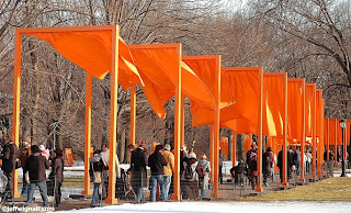
In 2005 a project called the Gates, created by artists Christo and his wife Jeanne-Claude, was put on display in Central Park in New York. It was one of the most ambitious and important art installations in history and millions of people experienced the fun and excitement of walking through endless miles of brilliant orange metal and fabric gates. I was fortunate enough to see the Gates on one of the last days of the installation and it was one of the most inspiring and enthralling art experiences of my life. It was also one of the most fun days I've ever had in New York City. Walking under the flapping bright-orange fabric flags, along with thousands of other art lovers, was a far more emotional and spiritually-exuberant experience than I had expected. Some kind of magic descended on Central Park that I think was shared by almost everyone who went to see the Gates and that magic changed the way we all thought about the park, art and one another.

It took nearly 25 years for Christo and Jeanne-Claude to plan, create and get permission for their incredibly ambitious project and it cost a fortune to produce. They believed in their art though and they had faith in the project that they had devoted so much of their lives to making a reality. And while some critics criticized and made fun of the installation, those people who visited walked around with frozen grins and excited expressions. I'm sure none of them will ever forget the experience of being there.

Sadly, Jeanne-Claude passed away in New York on November 18, 2009. In her life though, she and Christo changed the way the world looks at art and brought smiles and looks of wonder to millions of faces. Jeanne-Claude knew that art, whether "permanent" or temporary, is made to be experienced and to uplift the human spirit and that's why she spent her entire life creating it.

Whether you go to a museum to look at a paintings that are centuries old or take part in a live art happening, seeing art in person is a great way to awaken your imagination and to witness the power of creativity.

Go be a part of art and I guarantee the inspiration will show in your own photos.

Sunday, November 29, 2009

Need a Challenge? Illustrate a Concept


Sometimes the best way to push yourself to be more creative is to give yourself a challenge. One way that many art teachers do that is to have you illustrate a single word or concept, or a particular emotion. The word "quiet," for example, might be illustrated nicely by a person studying in the library, but it could also be illustrated by a harbor scene at sunrise. And while you can't see the wind, you can certainly illustrate the concept of wind--leaves blowing down the street, salt spray blowing off the tops of waves, etc.

Emotions are a great source of photo ideas. Think of the range of emotions that most of us go through in a typical day: happy, sad, pensive, blue, exuberant, excited, victorious, defeated, loved, lonely, etc. If you have young kids around the house you're likely to see this spectrum of emotions on an almost hourly basis and taking pictures of those emotions and moods is a great way to add depth to your family album.

Even if you don't know your subject though, you can often try to imagine the emotions they're feeling and then accent them using the tools of composition, exposure, color palette, etc. To me the photo above perfectly illustrates the concept of the word "alone" or "lonely;" though that is just my interpretation of the scene--there's every possibility that the person in the photo isn't feeling lonely at all. In composing the shot I used a normal lens and a very open framing so that the person standing on the jetty was engulfed in a huge area of sky and sea. I also shot on a somewhat overcast day and late in the afternoon so that the palette of the scene emphasized the solitary nature of the moment.

Interestingly, as I was composing this shot, I heard the lines of John Masefield's poem "Sea "Fever" (my mother's favorite poem) running through my head: "I must down to the seas again, to the lonely sea and the sky..." I'm not sure if I was thinking of the poem first or saw the potential image and that made me think of it, but either way, the word "lonely" was in my head.

What concepts does the photo conjure for you? Peacefulness? Serenity? Loneliness? Memories of summer? Wanderlust?

Challenges push you forward as an artist both visually and emotionally and finding ways to illustrate ideas and concepts is a great way to hone in on your personal vision. And if you have ambitions to sell your photos or become a professional, you'll find that most photographs are assigned, or purchased through stock sources, based on your being able to illustrate concepts rather than come back with photos of specific subjects. The photo here, for instance, could be used to illustrate a financial ad ("When it comes to investing decisions, you're on your own.") or a Hallmark card ("When you're away, the world seems empty."). Merging visuals and emotional concepts is precisely what the advertising world is all about.

Saturday, November 28, 2009

Have Some Fun with Off-Beat Travel Portraits

It's fun to make travel photos more personal by including photos of the people you're traveling with in front of some of the landmarks that you're visiting together. Even if (like me) you prefer to rarely make an appearance in the photos yourself, you'll always be a part of the photos because you shot them. Taking pictures of your travel companions just standing there staring back at the camera can get old pretty fast, however, if you don't find some way to make the experience a bit more interesting for them and you.

One way to change things up a bit and get some interesting photos in the bargain is to use lenses, like ultra-wide-angle lenses, that were never really meant for portrait photography. To take this shot on the steps of Assateague Light in Virginia, for example, I used a Sigma 10-20mm ultra-wide-angle zoom (equivalent to 15 to 30mm on my Nikon D90 camera body) and a very low angle to stretch out both the doorway and my friend and make them both seem much taller than they are in reality. In order to get his very low angle, I had to literally lay down in the sand at the foot of the stairs and shoot nearly straight up. I also used the "live view" feature on the D90 that lets you compose on the LCD--a feature that I rarely use--to make composing the shot easier on my neck.

You can also get some interesting portraits by going the opposite way optically and using a very long telephoto lens to photograph someone in front of an unexpected background. You'll have to shoot from farther away, of course, but the compressed feeling that a long telephotos lens (any lens that is say, the 35mm equivalent of 300mm or longer) creates can be very eye catching. If you were to photograph someone standing on a street corner in Manhattan with a very long lens, for example, the compression would compact the spaces and press your subject into the traffic and crowds behind them. Your subjects will probably find the idea of posing a half block away more interesting too and they will no doubt feel more relaxed by not having to smile into a camera three feet away. (Just don't let them get so far away that they can escape on you.)

Whether you're shooting with a super-wide or super-long lens, take time to pause for a moment and show them the first few frames on the LCD. Once they see how off-beat the photos look they'll be more willing (hopefully) to pose a bit longer and be open to trying some of your extreme portrait ideas later in the trip.

Friday, November 27, 2009

Inspire Someone You Love, Give Them a Book!

Well, OK, since it's "Black Friday" and everyone is talking about holiday shopping , I'll join the chorus and talk about book shopping or, more importantly, book giving (and that includes giving them to yourself). Since I was a kid I've always loved getting books as gifts and since I got seriously interested in photography in my teens, I've loved getting photo books. Fortunately my father was a photographer and my mother loved art and books. My mother also knew how much a single book could change someone's life and bring them the inspiration they needed. She was very good at finding just the right book for me at the right time in my life.

When I was about 15 and going through that typical teenage angst about what my life meant and what I might do for a living someday, my mother gave me Edward Steichen's autobiography A Life in Photography. It literally changed my life. I practically slept with that book (in fact, I probably did fall alseep with it in my bed) and found it enormously comforting and inspiring to read about Steichen's career told in his own words. It was probably no small coincidence that she chose Steichen's book as the first big monograph she bought me because I'd met him as a kid (though I didn't have a clue how important he was at the time). The next year, based on Steichen writing so much about how important Alfred Stieglitz was to him, I asked for (and got) Dorothy Norman's biography of Alfred Stieglitz, An American Seer. Reading that book was such an exhilarating experience for me that I could barely sit still while I read it. Stieglitz was responsible for giving many of the great photographers their first public exposure in his famous "291" gallery and he forever changed the course of photography and art (he was also married to Georgia O'Keeffe, who has always been my favorite artist). Around that same time my mother met Ansel Adams by chance (and talked his ear off, I'm sure) in Yosemite Valley and the next year my parents gave me his amazing book The Camera. It's the best book on camera technique ever written--and it always will be.

It was in reading those books (and many others that I got as gifts) that I discovered that photography was more than a hobby, it was a passion, a way of seeing the world, a way of living--and that photography was as high a form of art as any other. My head was nearly exploding with photographic inspiration in those days and my poor parents probably realized that giving me all of those books wasn't helping their cause in getting me to take up more financially-stable career like being a lawyer or a carpenter or flipping McDonald's burgers, for that matter.

I guess the point is that books can change people's lives. Books still change my life everyday. I love the idea of these new electronic readers like Kindle (from Amazon) and Nook (from Barnes and Noble), but there is no thrill equal to opening the covers of a brand new book and discovering the worlds within. I will always be grateful to my parents for having a houseful of books and for turning me on to the treasures of knowledge, inspiration and adventure that they offered.

If you know someone who has an interest in photography (or any other subject, come to think of it), consider giving them something that will last them a lifetime and might change the way they look at the world (and themselves): a great book. Whether it's a monograph that shares a photographer's life work or a how-to book that helps them develop their own talents, books are an amazing bargain. I've always felt (and this isn't just because I write books for a living--because I buy a lot of books) that if you pay $25 or $50 for a book and get one great life-changing idea from it, you've just got the bargain of a lifetime. I've put a page of Amazon links to photo books on my main site and maybe they'll give you some ideas. But if you really want really want to experience the fun of giving someone a book, spend a few hours in a local bookstore and touch and explore the books yourself--and while you're buying books for other people, maybe you'll buy one for yourself. You deserve it!

Oh, wait, I almost forgot to plug my own new book Winning Digital Photo Contests! Wheww. Glad I remembered. Happy shopping.

Wednesday, November 25, 2009

Photoshop Tip: Create an Old Fashioned Postcard Look in Just a Few Clicks


I love the look of old travel photos and especially those old sepia postcards that you find at flea markets and yard sales. It's amazing how those images bring back the feeling of another era in time and a more adventurous vision of travel. But you don't have to visit antique sales to find those kinds of images, you can create them in Photoshop from "new" photos with only a few quick clicks. I shot the photo here a few winters ago in Florida and you can see that just adding a slight sepia tint gave it that antique postcard look.

Creating the effect only took a few minutes and here's how I did it:
  • First, choose a photo that has a sort of old-fashioned look to it. In this case by selecting a scene of a dirt road and palm trees, the picture really captures the feeling of "old" Florida.
  • Next, do a quick curves (or levels) adjustment just to get the exposure right, but keep the contrast somewhat flat. I didn't do any other editing to this image--it's not even cropped. In particular, I didn't sharpen the image because I wanted it to have that soft, aged look.
  • In either the adjustments menu (Image>Adjustments) or at the bottom of the layers palette (I always choose the latter because you can turn off adjustments made as a layer) select the photo filter option. Then select a warming filter and crank up the warmth and use a high density. In this case I chose a #85 warming filter and ran the density up to 97. The higher the density number, the more filtering you get.
  • Finally, I opened the hue/saturation tool (also in the layers palette) and, using the "master" setting, I desaturated the image until the setting was about -67.
That's it. There are probably a few dozen other ways to create a good sepia tone from a color image, but this one was really quick and easy. If you know how to use the photo filter and hue/saturation tools, you can make these adjustments in about 20 seconds. If you're new to editing, don't let the instructions make it sound complex, it's really not. Once you get used to poking around the menus a bit and learn to always use the layers palette for editing your images, you'll find adjustments like this are a breeze. If you'd like to see other Photoshop tips, or have questions about this one, just leave a comment or send me an email and I'll post more of them.

Tuesday, November 24, 2009

Give Your Sunsets a Great Foreground

It's easy to look at a pretty sunset or sunrise and think that nature will do all of the work for you when it comes to photographing it. With all that color and drama, what's not to like? But you can improve any sunset/sunrise by simply finding a good foreground to place in front of it. Because you want the colors and cloud patterns (or sky reflections, if you're near the water) to dominate the shot, you want your foreground subject to be simple, yet interesting. Also, because it's likely that your foreground will end up entirely in silhouette, you also want a subject that's bold enough to be reduced to lines and shapes and still add interest to the photograph.

I took this shot of the rigging in a commercial fishing boat in Galilee, Rhode Island and I really like the way the complex web of stays and ropes creates such interesting patterns. It took me a while to find the shot though--even though I had been scouting around the harbor an hour or so before sunset. I was really hoping to get a shot of a boat pulling into or out of the harbor, but all the boats were tied up for the night. After walking around the marina in a slight state of panic for what seemed like an eternity (it was probably only about 10 minutes), afraid that I might miss this great sunset and not get a good shot, I looked up into the rigging of this boat and knew it would make a great shot. I planted my tripod on the dock and fired off a few dozen shots as the sky grew more intense and then started to fade, shifting my position slightly after each few frames.

Scouting ahead of time is the real key to finding a good sunset foreground. I've always found it's better to sacrifice an hour of late-afternoon shooting to do more scouting if I think there's going to be a great sunset, because I know that the combination of an interesting foreground and a great sunset make really pretty photos. Better yet, scout earlier in the day, at midday perhaps, and just be sure you get back to your sunset location in time to catch the sky show.

Monday, November 23, 2009

Stop & Look at Scenic Overlooks

I'd be the first to admit that I've never taken a very good picture from a scenic overlook and the reason is fairly simple: while overlooks provide a good wide view of the landscape around you, they're too broad and unfocused to become worthwhile landscape photos. But that doesn't mean that I don't stop and look at the view when I come across an overlook. In fact, I go out of my way to find them on maps or to ask locals where the best scenic views are found. Whatever they lack in terms of more intimate subject matter, these wide vistas are great at giving you the lay of the land and showing you just where you are traveling.

I shot this photo on my first road trip between Phoenix and Flagstaff and just seeing this view and the winding dirt road leading off into the mountains gave me a great sense of the scale of the landscape and a beautiful panoramic view of the surrounding mountains. The shot was taken just a few steps from an interstate highway, but it's not the kind of view you get to study at 60 mph (unless you want to end up a part of the view). There were also some nice historical and natural-history markers in the pull-off parking lot and some very detailed state maps on display, so all-in-all, a great place to get better acquainted with where I was and what Arizona looked like.

You may or may not get a good photo from an overlook, but they're certainly worth visiting. In fact, anything that gets you off the interstate for a few minutes is a great thing, photographically and otherwise.

Sunday, November 22, 2009

The Many (Almost Magical) Uses of a Polarizing Filter

If someone told you that they could sell you a single lens filter that could darken blue skies, saturate colors, remove surface reflections (including window reflections), intensify rainbows and reduce haze--would you buy it? You bet you would. And a polarizing filter can do all of those things and, at times, they seem like an almost magical accessory.

Polarizing filters are one of the most versatile and important photo accessories that you can own and, even though I use one less with digital cameras than I did with film cameras (I'll explain why in a minute), I still use one regularly. Polarizing filters work (there's a lot of physics going on here and you can find lots of info online if you're curious) by blocking certain wavelengths of light from entering the lens and allowing others. They are sold in a rotating mount that screws to the front of your DSLR lenses and as you rotate the filter, it blocks different wavelengths. Among the things that a polarizing filter does superbly well:

  • Darken blue skies. Be blocking extraneous scattered light reflections in the atmosphere, you can rotate the filter to darken blue skies. I use them less for this than I used to because I can create the same sky-darkening in editing and have somewhat more control. I also feel that polarizing filters tend to over-darken skies with digital cameras if you're not careful about exposure and the exact rotation position. Sky darkening works best when the sun is to your right or your left (of shooting position) and not at all when the sun is behind or in front of you. You can see the effect in the viewfinder as you turn the filter and as you alter your position to the light.
  • Saturate colors. Again, because you're blocking superfluous surface reflections, when you turn a filter the colors of things like leaves and grass or people's clothing becomes more (or less) saturated. This is the main thing that I used to use polarizing filters for, but again, I can saturate colors more selectively in editing. Still, I will sometimes use a polarizing filter with landscapes where I want to control the color saturation at the time I'm shooting.
  • Eliminate reflections. This is something you can't do very easily in editing! You can remove reflections from any nonmetallic surfaces just by rotating the filter. If you're shooting a store-window display, for example, you can penetrate the reflections to reveal what's behind the glass. This can be a real life saver in a lot of situations, especially when you're traveling and might shoot a lot of store windows or displays.
  • Reduce atmospheric haze. Polarizing filters are much more efficient at reducing haze (not fog) than so-called "UV" (ultra-violet) filters and they're essential in landscape photography for that reason.
  • Intensify rainbows. No joke! By reducing the atmospheric haze and by blocking certain wavelengths of light you can strengthen the colors of a rainbow substantially. And because you can see the effect in the viewfinder, you can decide how much intensity you want (yeah, like anyone would dial up less than maximum color with a rainbow).
Polarizing filters are not inexpensive and you will probably spend between $40-100 on a good one. If you're using auto-focus lenses, be sure to buy a "circular" filter, but check your lens or camera manual to be sure of the type you need.

Saturday, November 21, 2009

Beware the Six-Legged Horse

If you look closely as this photo, you'll notice that the horse appears to have four front legs. This is a beautiful (and huge) draft horse, so I'm not sure if that would make him stronger or not, but it sure makes it look a bit like a circus freak. The problem, of course, is that the other half of this team is standing right behind the front horse and all that you're really seeing from the second horse are its front legs.

Unfortunately at that moment the horses had just finished working and were eating furiously, so I wasn't going to ask the owner to pose them better for me. I only shot the photo because it was such a beautiful and big horse, I wanted a snapshot of it. The point is, though, you really have to keep an eye on backgrounds. Had this been an important shot I would have waited or worked harder to find another angle. But it was just a snapshot at a country fair, so I let it slide. But do beware (and be aware) of backgrounds when you're shooting--especially people and animals--or people may think you're shooting pictures at the sideshow.

Friday, November 20, 2009

Informal Group Portraits: Get Them to Smile!


Not everyone likes to get their picture taken (me emphatically included), but the trick to shooting happy portraits is to make your subjects look like they're having a grand time. And the secret to that is getting them to smile--and not just a 99-cent fake smile for the camera, but a genuine happy smile. The best way I've found for doing that is to have someone else doing the dirty work for you--preferably someone that your subjects like and have fun being around. In this case is was the father/grandfather who was kidding with the three women just a few feet off camera. By having someone else interacting with them, as opposed to you saying, "OK, smile" it gives you a chance to watch for nice moments and keep your face pressed up against the viewfinder (or looking at the LCD) and paying attention to camera controls. Also, it helps if you're shooting from a slight side angle because then your subjects are interacting naturally with someone off camera and looking directly at them rather than into the lens. By the way, all outdoor portraits work best when they're shot in open shade with just a touch of flash to open up the face. If you set the white balance to "cloudy weather" it will warm the flash up nicely too.

Thursday, November 19, 2009

Create a Blue Flamingo

Imagine--a blue flamingo! Everyone loves fantasy, I think, and nothing conjures more romance or imagination than the idea of a totally new species of animal. Unfortunately, this bird is pure fantasy and I created it (from a shot of a pink flamingo, of course) in Photoshop. The first time I put a version of this shot on Flickr, however, two interesting things happened: For one, it got the highest number of views of any image I had on the site. But also, the photo got ripped off faster than you can possibly believe--I found it on blogs, websites, ezines and even on the cover of an online menu for a restaurant. (I didn't have to sue anyone, by the way, but I did go after every single abuse.)

Creating this wonderful bird was a lot easier than you might think and it was all done with the hue/saturation tool in Photoshop (Elements has the same tool). Here's how to do it:

  • First, choose a subject with a bold overall color. The flamingo worked well because it was just various shades of pink (even the legs are pink) and white.
  • At the top of the hue/saturation window, look for the pull down menu that says "Master." Under that you'll find a list of all the colors. Choose the color that matches your subject (in this case, I selected red). If you were doing this with a lemon, for example, you would choose yellow.
  • At the bottom of the hue/saturation window you'll notice there is an eyedropper tool with three boxes: the eyedroper, the eyedropper with a "+" symbol and the eyedropper with a "-" symbol.
  • Select just the eyedropper and click anywhere in your subject. That tells the tool what color you want to change. Now select the eyedropper+ box and then click as many times as you like to pick up more shades of your chosen color (I probably made about 12 different clicks within the flamingo to pick up various shades of red and pink).
  • Now adjust the hue slider and watch what happens. The color of your main subject (a flamingo, a lemon, etc.) will begin to shift colors radically. Interestingly, because you chose a specific color from the drop down menu, only that color will shift. The remaining portions of your photo will remain the same. So if you were doing a lemon on a blue background and had selected yellow and sampled just yellow areas, only the yellow would change hue. The blue background would remain exactly as it was.
After I changed the flamingo from pink to blue, I did some touching up (darkening selected areas of the background, healing some tiny flaws in the water, etc.) and then did an overall curves adjustment. You'll notice there is still a tinge of pink in the flamingo and I could have gotten rid of that by going more extreme with the hue shift, but I kind of liked the pinkish color coming through a bit. This is a really simple Photoshop trick and in the next tip I'll show you another application of it--turning a sunset into a moonset. Stay tuned!

Wednesday, November 18, 2009

Take Spot-On Light Readings with a Spot Meter

Spot metering is the ultimate refinement in metering small, selective areas, because it reads only one tiny area of the viewfinder, typically only a few centimeters in diameter. In my Nikon D90's viewfinder, for example, the spot metering is done in an area that's just .14 inches (3.5cm) across which represents just 2% of the overall frame. The purpose of this mode is to let you take metering readings from very exacting and specific areas of the frame.

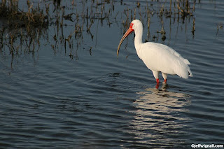
These days I use the spot meter less and less because, I have to admit, the matrix metering (see the previous tips) is amazingly accurate. Before the days of such dependable matrix metering, I did use spot meters much more frequently. Still, there are circumstances when a spot meter is the best (and sometimes the only) way to get an accurate reading. While photographing this white ibis in Florida, for example, the bird was completely surrounded by very dark--almost black--water. A matrix reading of this scene would have given me medium gray water and probably a very overexposed (washed out) bird.

I probably could have used the center-weighted meter for this shot because the bird is relatively large in the frame, but I chose the spot meter so that I could be sure the reading was only coming from the bird. Because the bird was white, however, I did have to add +1.3 stops of exposure compensation to keep it white. (I based the amount of compensation on experience and looking at the histogram, by the way.) Had it been a medium-toned subject (a great blue heron, for example, which is gray), I could have just gone with the straight spot reading. Still, knowing exactly what I was metering helped me determine the correct amount of compensation.

You probably won't use the spot metering mode very often, but when you are confronted with a very small yet important subject area against a very bright or very dark background--a small flower blossom against a black shadowed area, for example--it can be a real life saver. Read your manual (or a Magic Lantern Guide if one is available) for more info on using specialty metering modes. I learned from reading Simon Stafford's excellent D90 Magic Lantern Guide, for instance, that the spot meter is tied to the active AF (autofocus) points in the Dynamic-area AF mode, so the spot metering area will follow the active AF area--something very important to know if you're using Dynamic-area AF and spot metering combined.

Tuesday, November 17, 2009

Meter in the Middle of the Frame

As I said in the previous tip, the matrix or evaluative meters that are in virtually all cameras these days are very accurate even with scenes that would have many seasoned photographers scratching their heads. There are some situations though when metering only a specific region of the frame will provide more reliable results. One of the options for those situations is center-weighted metering.

As their name implies, these meters concentrate their readings on a small central region in the viewfinder. That are is typically about 8-10cm across, though on some cameras (like my Nikon D90) you can select from three different sized areas--8mm (the default), as well as 6mm and 10mm. The meter doesn't meter exclusively from that area, but typically gives that area about 75-percent of the "weight" or importance and about 25-percent to the remainder of the frame.

The advantage of center-weighted reading is that you can tell the camera to give more importance to one specific subject or area within the frame. In this shot of an old New England headstone, for example, I knew that the slate stone would be a perfect middle tone (middle tones provide the most accurate readings with any meter) and that the snow might otherwise fool the meter into thinking there was more light than there really was and underexpose the stone. The meter read the entire scene, but put most of its emphasis on the middle-toned subject. The meter reading was perfect. The matrix meter might have provided just as good a reading, but why risk it if there is a more accurate method?

Center-weighted metering works best when there is a mid-toned subject of small, but not tiny, size within the frame. By reading off that subject and then using your meter-lock function (usually just holding the shutter-release button down halfway), you can lock that reading and get an accurate exposure for the entire scene.

In the next tip we'll talk about taking meter readings when the subject you want to read is especially small.

Monday, November 16, 2009

Understanding the Three Types of Light Meters

Many digital cameras (including virtually all DSLR cameras) offer a choice of three light-metering options, typically including: matrix (also called evaluative metering), center-weighted and spot metering. Understanding how these metering types differ from one another and knowing when to use each is an important part of getting a good exposure. In today's tip I'll discuss matrix metering which is, by far, the most frequently used metering method (and with good reason).

Matrix meters work by dividing the frame up into a complex pattern grid that covers the entire frame. The camera then uses a series of algorithms to compare the various brightness regions of the frame and arrive at a good exposure. The way that these algorithms are programmed is nothing less than astonishing in their sophistication and complexity. The cameras have been programmed with the results of hundreds of thousands of potential exposure situations and when you point your camera at a scene, the camera's micro-computer compares the scene you're shooting to all of those exposures to find the one that most closely matches your subject. Sounds like science fiction, I know, but it's all true--and it happens in the blink of an eye. Many matrix meters also take into account not only the colors of your subject but, using information from the lens and focusing system, determine which parts of the scene are closest to the camera and are likely the main subject. Wheww!

What the camera is looking for as it analyzes a scene are familiar landmarks of shape, color and tonality (brightness). In a really simple scene, for example, if it sees a tall vertical subject of average tone in front of a bright background in the upper half of the frame and a slightly darker foreground below the subject, it makes an educated guess (a very educated guess, since it was probably a team of supergeeks from MIT that programmed it) that what you're shooting is a person standing on a green lawn in front of a bright blue sky (and wearing a red shirt). The camera no doubt also knows that your subject just got back from a week in Miami and has a nice tan. And in most cases, it would be correct. It then rummages around in its memory banks to find what it "thinks" is the best exposure for that subject.

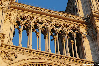
The amazing thing about matrix metering though, is that it can handle far more complex scenes than that. In my shot of Notre Dame above, for example, the meter has determined that what I'm shooting is a bright yellow subject (it probably even knows it's a piece of architecture based on the shape pattern of the subject) against a blue sky. But even that is a mild challenge for a matrix meter. I commonly trust matrix metering when shooting subjects like a bright blue dragonfly sitting on a dark green leaf in front of a black pond with sunlight reflecting off of the water. And the exposures are (as the Brits say), spot on.

Matrix meters are extraordinarily accurate in a huge range of lighting situations, both complex and simple, and that's why they are the default metering systems of most cameras. In the next few tips I'll talk about the other types of metering methods and why you might choose them over the genius of matrix metering.

Sunday, November 15, 2009

Don't Be a Slave to Sharpness

When it comes to image quality, I probably spend more time and effort on getting pictures sharp than anything other than technical consideration other than exposure. I use a tripod religiously, always check my shutter speeds and, with action subjects, I wait for the peak of action to shoot. But not every subject calls for a perfectly sharp picture and, in fact, some call for just the opposite.

I shoot a lot of concerts and while I always try to get nice sharply focused shots of the performers, if they have a really active stage presence, I often slow the shutter speed down and try to intentionally blur some frames. I've photographed Professor Louie (shown here) many times and I've got hundreds of sharp photos of him, but during this particular show the light was kind of low and I knew that once he started rocking out, getting sharp pictures was going to be tough. Instead of fighting the situation, I decided to slow the shutter speed to 1/2 second and just let the motion become the picture. I also intentionally shook the camera a bit during the exposures. I love the way the light is streaking off of the keyboard and the Professor has become an impressionistic blur.

Don't become a slave to sharpness. When the situation calls for it, instead of stopping the motion, exaggerate it.

Saturday, November 14, 2009

Silhouette the Landscape

In previous posts I've talked about creating silhouettes from isolated subjects, but there's no reason that you can't take that idea to a larger scene--namely the landscape. Essentially the process is exactly the same, you find a dark subject against a light background and expose for the lighter area. Finding landscape subjects for this kind of treatment is a bit tricky and the best place to look (did you guess already?) is along the edges of hilltops.

Because hilltop landscapes (a row of barren trees, windmills, a lighthouse) are situated against the open sky, they're easy to silhouette. I found this farm scene in a rural corner of Iowa and I envisioned it as a silhouette from the moment I spotted it. I worked the scene from a lot of different angles and with several focal length lenses, but I knew that I wanted three main elements in the scene: the tree, the edge of the barn and a cow. The cow was the tricky bit because every time I fine-tuned the composition, she went for a walk. I had to wait almost a half an hour for her to walk into the frame where I wanted her (I was starting to wish I had a cardboard cow to substitute for her). The line of the fence tied the whole scene together.

The only editing that I did to this image (all in Photoshop CS3) was to enhance the contrast a bit (using the curves too, but the brightness/contrast adjustment would have worked) and I also used the selective color tool to clean up the white sky a bit. One last tweak that I made was to use the midtone slider in the levels control to bring up just a hint of green in the foreground grass. But to be honest, the silhouette straight out of the camera would have been very close to what I wanted.

Don't be afraid to tackle more complex scenes as silhouettes because the results are usually very interesting and it's easy to tweak scenes like this in editing.

Friday, November 13, 2009

Eliminate the Subject...and Just Shoot the Reflection

Whenever I'm photographing near any kind of reflective surface, whether it's the surface of a pond, a store window or a shiny car fender, I try to find ways to use the reflections in the composition. I think that including reflections as a component of a larger composition adds an element of color and depth that brings an extra level of visual interest.

But reflections can also make interesting photographs when the subject itself is cropped entirely out of the frame. Isolated reflections have a very romantic, impressionistic feel, often bordering on abstraction. I shot the photo here while photographing a landscape scene of the trees that included a small bit of this reflection in the foreground. As I was shooting that larger scene, however, I began to notice some interesting possibilities using just the reflection. Within a few minutes I was so engrossed in shooting isolated views of the reflection that I completely forgot about the landscape scene. Sometimes you just have to go with the creative flow (which I guess is what creativity is all about).

There are some interesting benefits to photographing reflections, particularly when you're shooting them in water. For one, if the surface of a pond is dark (especially a very stagnant pond like this one) the colors will be more saturated. Also, if you have a breeze or some ripples (just toss a stick in the pond if you want ripples), you get an added level of abstraction. It's important though to use a relatively small aperture (I shot this at f/9 but wish I had shot at f/11 or smaller) when photographing a broad reflection to be sure that the surface will all be in focus. Remember too that you can use a polarizing filter to enhance the saturation even further by eliminating surface glare on the reflective surface (as long as the surface isn't metal).

Keep an eye open too for unusual reflective surfaces. While hanging out near the Eiffel Tower one day I noticed some interesting reflections in a dark-tinted tour bus window and spent about 15 minutes photographing them from various angles. I think I had more tourists looking and me and wondering what I could possibly be shooting than looking at the tower.

Next time you're out by a pond or walking past a large picture window, see if you can't find a shot of just the reflection. You may find out you don't need the actual subjects at all!

Thursday, November 12, 2009

Pet Portraits: Focus on the Eyes

When it comes to taking interesting photos of your pets one great piece of advice is to focus on the eyes--both figuratively and literally. Anyone who has ever owned a cat or dog (or a hamster, for that matter) knows that animals have very expressive eyes. You don't have to live with an animal long to know when they're apologizing with their eyes for knocking over your favorite lamp. Personally I think animals are well aware of the power of their eyes and alternately use sad/loving/adoring looks to mooch extra snacks.

Using the eyes as a focus point in more physical terms is also a good idea because, as with human, eyes are the most interesting part of their faces. Since most portraits are shot with medium-telephoto lenses or zoom settings where depth of field is minimal, focusing carefully on the eyes also gives you one certain point of sharp focus. People looking at your portraits won't even notice if the ears (or whiskers) are slightly out of focus as long as the eyes are sharp and bright.

Tuesday, November 10, 2009

Include a Dark Foreground in Landscapes


I like landscape photos that really pop off the page, that have some element of drama that forces you take notice of them. One simple way to do that is to frame your scenes, when possible, with a dark foreground. Because the eye naturally seeks lighter areas or areas with more color, using a dark foreground helps to point the viewer to your main subject. It's easy to find dark foregrounds just by exploring a scene a bit until you find an area that is not as brilliantly lit as your main subject. In this scene I used an area of marsh grass along the riverbank that was in shadow and contrasted it with the brightly lit boats. By exposing for the brighter areas the foreground went even darker and made the frame a much bolder element. Also, I was careful to include the dark pilings on the left side of the frame to tie the foreground and middleground areas together.

Photo notes: Photographed with a Nikon D90 with a 24-120mm Nikkor zoom at 120mm (180mm in 35mm terms). Exposure was 1/125 at f/5.6. White balance: cloudy weather.

Thursday, November 5, 2009

Start Your Own Alphabet


Here's a fun little self assignment: See if you can collect photos of all the letters of the alphabet. I've seen other photographers do this and I have always thought it was a fun idea since I seem to spot letters in some really curious places and have always liked collecting them. Your photos don't have to be great works of art, just clear shots of individual letters. I collect them in a separate folder and label them with keywords for where they were shot. This "G," for example, was shot in a marine park in Lewes, Delaware. The letter was painted in bold script on a giant harbor float of some kind. (I've included a wide view so you can see what the overall scene looked like.) Finding letters like this is a good seeing exercise because it forces you to look for details--and it's also downright addictive.

Wednesday, November 4, 2009

Sunset Photos: Wait for the Afterglow

A lot of times when I'm shooting sunsets at this particular beach, I'll see people hop out of their cars snap a few frames as the sun hits the horizon and then leave. Those are probably nice shots, but the real show often begins about five or ten minutes after the sun has hit the horizon and it's called the afterglow. It's during this brief afterglow that color flares up into the sky the clouds really catch fire.

The reason that the afterglow is so intense is just that the angle of the sun is causing direct light rays to bounce around in the cloud cover and scatter on the layers of dust, moisture and pollution. Believe it or not, the more pollution there is, the better the sunsets. After a forest fire or a volcano eruption the sunsets are often spectacular for weeks and weeks as the dust lingers in the atmosphere. Even more amazing, these clouds of volcanic dust travel around the globe in jet streams and, in fact, when Krakatoa exploded in August of 1883 the sunsets were so intense as far away as New Haven, Connecticut (nearly half the circumference of the Earth away) that people thought the sky was on fire. There are reports of the fire companies responding to fires in the sky!

Next time you're photographing a sunset, especially if there are interesting clouds, hang out and wait for the real show to begin. And incidentally, not only did I not saturate the colors in this shot (same clouds and sunset as the last two postings), but I actually had to tone them down because the yellows, pinks and reds were bleeding together too much. The only area that I saturated a tiny bit is in the reflection in the smooth water at the bottom of the frame to the left of center--I just wanted that spot of color to brighten the foreground a bit.

Tuesday, November 3, 2009

Expose Sunsets for Maximum Drama

One of the things that I like about shooting sunsets (and I shoot a lot of them) is that you can tweak the drama scale just by changing the exposure a few stops. And because there is no right or wrong exposure for sunsets (or sunrises if you're one of those nutty morning people), you have a real wide latitude of what constitutes a "correct" exposure. In fact, with sunsets, the only perfect exposure is the one that you like the most.

Most of the time, the safest way to get an technically acceptable sunset exposure (one where you can see some foreground detail and also get good color in the sky) is to meter without the sun in the frame. Just point the lens away from the sun itself, use your camera's exposure-lock feature to hold that exposure and then refocus. You might find though that this somewhat middle-of-the-road safe exposure is too bland for your tastes. One way that you can intensify the drama is by taking your exposure reading from a brighter area of the sky; again you still don't want the sun itself, but if you expose for a brighter area, you'll get darker, more saturated colors.

In this shot, for example, I did take some shots with the lens pointing at the darker clouds in the upper right, but the sky was too washed out (because I was metering a dark area the camera tried to expose for a darker subject). But then I took some frames, including this one, where I metered for that bright area along the horizon. These exposures were about two-and-a-half stops less than the ones where I metered with the sky and it really enhanced the drama.

Tomorrow: Same sunset shot during the afterglow--it will blow you away.

Monday, November 2, 2009

Follow the Clouds to the Sunset

Over the years I think that I've developed a nose for great sunsets (I can also smell a fresh-baked chocolate chip cookie a block away) and whenever I think one is about to happen, I make tracks for the beach. The best sign I have that a great sunset is on its way is a really interesting or intense cloud formation. I shot these clouds a few days after Halloween and the skies had been pretty much overcast all day. Toward the end of the day though I was taking a walk by the local seawall and noticed the cloud cover was starting to break up into interesting shapes. I particularly liked the dark bluish clouds mixing in with the lighter clouds. Often this is the perfect combination for a dynamite sunset, so I cut the walk short and drove over to a beach that has a better western view.

I got to the beach about a half hour before the sun hit the horizon and got to watch as these amazing clouds morphed from one shape to another and shifted from this white/blue combination to a more yellow/gold and then finally, as the sun hit the horizon, a beautiful crimson sunset spread across the sky. The sunset was so spectacular that a steady stream of people were hopping out of their cars with their cell phone cameras to photograph it. In the next tip I'll show you what the sunset looked like...it was quite amazing.

Today's advice is: when you see great clouds, expect a great sunset.

Sunday, November 1, 2009

Tricky Treat: Mixing Flash and Holiday Lights with the Night Portrait Mode

The importance of Halloween (and the festive illumination to go with it) has taken on increasingly epic proportions at my house in the past few years. What started out as a few casual strands of orange lights a few years ago has now become a long (and fun) afternoon of stringing lights and decorations the week before the big day (or I should say, the big night). My girlfriend is the creative power behind it, I just supply the extension cords and the occasional rubber spider.

This year the lights looked so nice that I wanted to be sure that I had a photographic record to remember them. I shot some quick snapshots on Halloween night, but the truth is that we were so busy handing out candy (more than 100 kids showed up!) that I wasn't able to concentrate on shooting pictures. The next day though I came home from an assignment and, tired as I was, I decided to see if I could get some photos that captured the fun and color of the Halloween lights.

The problem with photographing holiday lights is that even if you shoot at twilight (which you should) while there is still some lingering daylight, if you expose for the lights, the surroundings go too dark. And, of course, if you expose for the darker areas, the lights wash out. Also, in this particular shot, I wanted to get some detail in a rubber spider that was hanging in a twig-wreath from a Japanese maple next to the front walk. I tried some existing light shots using long exposures to get the lights, but the spider just disappeared in the dark background. Then I tried some straight flash exposures using the built-in flash in the "auto" mode and the photos looked way too much like flash photos.

As an experiment, I turned to the Night Portrait exposure mode--one of several scene modes on my Nikon D90. I rarely use scene modes because I can usually find a better combination of exposure tricks on my own, but occasionally when all of my cleverness fails me I give the auto scene modes a shot. In this case the Night Portrait mode worked like a charm. The spider and wreath have just enough light so that you can see them and the colored lights look very natural.

The Night Portrait mode works best when the subject you want to hit with flash is relatively close to the camera (I was about two feet away from the wreath) and the background is dimly lit, but not black. It works great in situations like photographing friends in Times Square or on the Las Vegas Strip when you want to get good exposure on your friends' faces and still capture the mood of the ambient lights behind them. With most cameras, when you switch to this mode the flash pops up automatically (as it does with the D90) so you don't even have to remember to turn on the flash.

Whenever you're confronted with an exposure situation has you a bit baffled, give those scene modes on the exposure-mode dial a shot and see if they don't provide a simple solution. Halloween may be over, but I'll always have my rubber spider's portrait to remember it.