Tonight I discovered a really cool new gadget that lets you add a playlist to your blog or website--for free. You have to register on the site Playlist.com, but it only takes seconds and again, totally free. Then you pick songs from artists you like and create your playlist, get code and off you go. I was only able to find four songs from my favorite artist Van Morrison, but also found several great songs from Iowa singer Greg Brown and a few from Iris Dement (who I think is Greg's wife). Give it a try, the sound quality is actually very good. I haven't had much new to say about photography lately because I've been busy with other projects, but hey, I always have time to listen to good music. Enjoy! Oh, and I dedicate the first song from Greg Brown to myself. For the last 17 years I've been doing an FM radio (WPKN.org) show and dedicating songs to other people: this one's for me. Hey, hey, hey, hey, hey...
Oh, by the way, I don't have any photos of Greg handy, but that's Professor Louie from Professor Louie & the Crowmatix in the photo here--I shot the photo using about 1/4 second exposure and giggled the camera a bit during the exposure to exaggerate the motion. You see, even when it comes to music I have to throw in a photo tip. And hey, while we're on the topic, check out the Professor's newest cd Whispering Pines. In fact, why not support the arts and buy the cd? The Crowmatix are one of the best bands in the world--if they come to a club near you, go see them. Tell Louie that I sent you and he'll buy you a beer. Maybe.
Saturday, March 27, 2010
Thursday, March 25, 2010
Dandelion Power! Let's Cost Scott's Some Money!
You've no doubt noticed that this site has Google ads on it. Theoretically what happens is that if someone finds an ad interesting, they click on it and I make a few pennies. Trust me, no one clicks on them. But today I was horrified, but not surprised, to find that Scott's lawn chemical company was one of the advertisers. They way that the ads are chosen is that a computer selects them somewhat randomly but based on keywords that they find on my site. I have no control over who advertises--though I can block them (and I will if they continue to advertise). The problem with Scott's advertising here is that they make lawn CHEMICALS that are intended to KILL the very things that my previous posting was written to help save!!! The computer that reads the blog for keywords, simply saw the word "lawn" a few times and thought, "Wow, a great place for a lawn chemical company to advertise." But they didn't read the context that I was against lawns and pro flowers. So, if you want to get a little revolutionary, if you see a Scott's ad--CLICK on it--and that will cost them some money. And the less money they have, the fewer lawns they can poison. It's just a thought. I'm not TELLING you to do it :) I'm only saying that if you did, you're costing them some money. It's totally up to you! :)
Wednesday, March 24, 2010
Ajuga Crazy? Don't Mow the Lawn Too Soon!
Well, even though we've only just enjoyed the first day of spring, the sound of lawn mowers has already begun in my neighborhood. Personally I have no idea what the obsession is with mowing lawns (especially in March--when there is snow in the forecast for later this week), but I have some neighbors that apparently think that tall grass is evil and must be mowed at all cost.
But one thing I've noticed over the years is that all sorts of interesting plants grow in most lawns (especially if you don't bomb them with chemicals and if you let the lawns get a bit rangy in spring), including dandelions, violets, grape hyacinth, snowdrops and this lovely blue plant called ajuga (also called bugleweed). Ajuga is actually a very (let me emphasize that, very) invasive plant and at one point a few years ago was taking over my entire front lawn. It has the odd characteristic though of suddenly up and disappearing after several years and that's what it did in my lawn; while I still have some, the lush fields of blue that I was getting (and loving) are gone.
Admittedly having pretty plants like ajuga growing in your lawn can be a pain because they tend to bloom at the same time the lawn is growing at its peak (early spring), so if you want to enjoy the flowers, you have to accept the idea that you'll be mowing much taller grass once the flowers have faded. Also, with invasive plants, if you let them go, they will take off and spread. But for me, having that beautiful carpet of blue in the front lawn, and a carpet of thousands of grape hyacinths in my back lawn (you should see how great the purple looks with the yellow dandelions) is worth the hassle. I complain a lot about mowing the tall after-flowering lawns, but I do get to shoot hundreds of photos.
And that, I guess is my point: if you too have great flowers that bloom in your lawn, why mow them down prematurely just to have short grass? Let's face it, lots of photographers (including me) travel far and wide (Arizona, Texas, California, Nevada) to photograph wildflowers--and then we turn around and mow them in our yards. Don't do it! This year let the grass grow a few weeks before giving it its first haircut and you may be surprised what nice photo subjects you have waiting--right in your own backyard.
By the way, here's a cool book Food Not Lawns: How to Turn Your Yard into a Garden And Your Neighborhood into a Community about turning your yard into a food-producing farm instead of a planet-destroying lawn. Pretty as they can be (especially surrounding formal gardens), lawns poison the planet, waste water and produce nothing! Don't poison your yard--eat it!
Sunday, March 21, 2010
Add Dynamic Power with Diagonal Lines
First, sorry that I've been away from the blog for the past week or so--just a case of spring fever and spending more time outdoors and less sitting at the computer. How I'm going to get through another summer of writing I don't know. Oh, but there is always my garden to tend in summer, so that keeps me from spending too much time at the computer. I actually haven't started a single seed indoors yet, and usually I've got a lot going by now, but I'll catch up this week--time to start those tomatoes or I'll be buying plants and I much prefer to grow my own. By the way, if you're looking for a good source of seeds, check out the Seed Savers Exchange site--a fantastic source for heirlooms seeds of all types.
OK, back to photography for a few minutes. When I was looking for an image/idea or today's post, I came across this shot of a "scarf dancer" (I don't know what her real title would be) that I shot last summer. The performer is a member of the family of acrobats that travel with Tino Wallenda and the Flying Wallendas. The thing that struck me about this shot, other than the very symbolic-looking Easter/spring colors (a good topic for another posting), were all the powerful diagonals in this shot. The ropes, her body, the scarf--all have a very powerful diagonal orientation. Even within the lines of her body are several very bold diagonal lines.
In terms of composition, diagonal lines emphasize power, strength and the feeling of impending movement--while horizontal lines, for example, bring to mind concepts of stability or balance, diagonals are better at creating a feeling that things are changing. If you look at a see-saw, for instance, you inherently know that when two people get on it, the balance is inevitably going to shift and the mind picks up on this idea whenever it sees diagonals, whether we realize it or not. You feel the same type of implied motion if you see a person walking up a hill--there is a much more dynamic feel to the scene that if you were to photograph that person walking down a flat sidewalk--yes? It's interesting to think of the psychological implications that something as simple as the direction of a line can impart to a composition and how you can change peoples' interpretations of a scene just by the way that you orient the lines within the frame. And, as with this scene, any time you multiply the number of lines, you intensify those feelings.
Monday, March 15, 2010
Meter for Details on the Shadow Side
In my last post I talked about metering bright desert sun from the frontlit direct sun side of a subject, but it's just as important to know how to meter accurately if you get brave and explore the shadow side of a subject. The problem with a lot of subjects that are backlighted is that the area behind the subject (the sky, the sea, snowy mountains) are often far brighter than the subject and more often than not the meter gets fooled by the bright areas. One way to handle this is to simply move closer to your subject so that the shadowed areas dominate the frame, giving less chance for the highlighted or bright areas to trick the meter. You can then use your meter lock feature (pressing the shutter release button halfway down and holding it will lock the exposure), but the problem is that most meter-lock features also lock focus (especially on simpler cameras). What this means is that if you move close and take a reading and lock it, you're also locking focus from that position. If you move back to take a wider scene, oops, the shot is out of focus. You can also zoom in for a closer reading, but if you're using a variable-speed zoom (which most zooms are--meaning the effective aperture changes as you zoom) then this will mess up the exposure, too.
The best solution, if your camera has it, is to put the camera in the manual exposure mode. In manual mode the camera will give you some type of viewfinder indication of the correct reading and once set, it will retain those settings until you change them. Then you can walk right up to your subject, meter until you get a good reading for the shadow side, and since the camera won't change the settings, you can shoot from anywhere with that reading--and, of course, refocus as often as you like.
If you don't have a manual mode, look and see if you camera allows auto-exposure bracketing. Using this feature you can shoot three (or more) frames in a row and alter the exposure for each frame by a specified amount--say, one full stop. When you press the shutter the camera shoots one frame at the meter reading and then one frame at one stop underexposed and another at one stop overexposed, etc. Your manual will explain the bracketing options (you do know where your manual is, don't you?). I often bracket even when I'm shooting manually just to cover myself--which is exactly what I did in taking this shot of the San Xavier Mission south of Tucson.
Keep in mind, however, that very often back-lit scenes have an extremely broad dynamic range (the range of dark to light areas) and sometimes the contrast is simply beyond the camera's ability to hold both shadow and highlight areas--so you have to sacrifice one or the other. But again, as with frontlit scenes, if you check your histogram after you've made a test frame, you can see if you're losing shadow or highlight detail.
Learning to meter in all kinds of situations will vastly improve your percentage of "keepers" and will save you tons of work in editing.
Labels:
frontlighting,
frontlit,
light metering,
San Xavier
Friday, March 12, 2010
Metering Hard Sunlight: Trust but Verify
One of my favorite places to shoot is southern Arizona. Not only are the deserts and mountains in that area beautiful, but the small towns have a great Southwestern charm. The only real problem with shooting in Arizona (other than that I have to fly to get there) is that at certain times of the day the light can be extreme and hard. And as much as I like to wait until the light is softer, shooting later in the day, for example, you can't just put the camera away for four or five hours and not shoot if your time is limited. Far better to look for subjects, like this pretty little storefront in the tiny town of Tubac, south of Tucson, that can hold up to the light.
Your next problem then is getting a meter reading that is accurate in such harsh lighting. Often because painted surfaces are so reflective, you think that you're going to get a good reading using a matrix meter and taking an overall reading, but you end up underexposing the subject. The camera simply thinks there is more light there than there is and, because it's determined to see all subjects as an average midtone, it turns the bright surfaces to midtones and banishes anything darker than that to deep black shadows. Not too attractive. The way that I handle this is to first just take a shot using the matrix metering and then looking at the LCD and the histogram to see how the test came out. If the histogram doesn't bunch up completely at either the left (the dark shadow area) or the right (the bright highlights) and concentrates most of its graph in the central area, you're fine.
If, on the other hand, the histogram does show too much shadow (there were probably a lot of highlight areas that fooled the meter into underexposing), you can simply add exposure compensation (I usually start with a full stop) and then check the histogram and LCD again. In this shot, for example, because the wall was close to a midtone, I trusted the matrix meter but the shot still came out about a stop too dark, so I added one stop of compensation and the combination was just about right. I was afraid to add more than that because the white doorway would have lost all detail. On this particular day I was shooting in RAW, so yes, I could have easily corrected the shot in conversion, but the closer you are to perfect in the camera, the less work you have to do later on.
In some extreme cases, if you have a large shadow area on a bright day, you may have the opposite problem, the meter may give too much weight to the shadow areas and the highlights will go too light (again, the histogram on the right end will have too much of the graph). In that case just do the opposite and take away some light using minus compensation. But again, unless you have a large shadow area, this isn't likely to happen.
In most cases I have a lot of faith in the matrix metering of my Nikon D90 and even in Tubac on a bright afternoon it provides great results. But like they say in the nuclear arms race: trust but verify. Unfortunately, we don't have a histogram to measure who is trying to fool us with their weapons caches! For a lot more about practical exposure options, check out my book Exposure Photo Workshop: Develop Your Digital Photography Talent. Shutterbug magazine called it, "...possibly the best book ever written on the topic." Nice folks!
Monday, March 8, 2010
Keep Working the Montage: Another Liberty
After writing about montage work yesterday, I kept working with a few different images of the Statue of Liberty. I find that the more I concentrate on just a small group of images the more ideas that pop up--it limits your picture choices and forces you to find new ideas with a limited palette. This is a montage of the Statue of Liberty and the New York skyline (both shot the same weekend) and it's totally just an experiment to try a few things. Essentially I used the method described yesterday--dragging one image (the skyline) onto the background image (the statue). I then made hue/saturation and selective color adjustments (to the overall montage and to each image) and then played with the blending modes until I found one that I liked (I ended up using linear light). But at this point the statue wasn't coming through strong enough, so I duped the background layer (Command J on a Mac) and again played with blending modes until Liberty's face come through more powerfully. Just by coincidence it was the same blending mode--linear light.
I don't know if this is a finished product or not (I kept one version with the layers open so I could go back and play more--a good idea if you're not positive you're done) but it has a kind of poster/graphic quality that I like. The skyline background is pretty abstract and you might not really know what it is, but I still think it has a bit of an urban/modern look. The fun thing about doing this is that you learn more about the tools you're working with and you create some fun colorful images along the way. And there's no right or wrong, so it's all just fun. We had a great weekend photographing the Statue of Liberty and exploring and I'm having a lot of fun going back and pulling more out of the images. In fact, I shot nearly 1,000 photos in three days, I think, so I'll be playing with them for a long time!
Sunday, March 7, 2010
Super Quick Trick for Making a Montage
One of the first things almost everyone does when they start to play with Photoshop is to make a montage from two or more images. It's easy and it's really fun to see what kinds of images work well together and which don't. Back in the film days we used to make montages like this using a slide duplicator to copy multiple images onto one frame of film and it worked pretty well (even color masters like Pete Turner were creating images this way) but, of course, you don't have a millionth of the control that you have in Photoshop. In Photoshop (or any other editing program really) you can combine as many images as you like and adjust the brightness and colors of each frame individually before you combine them.
One really fast way for combing images is to just open two different images and then use the move tool to drag one image onto the other. If you just click on the move tool and then click on one of the two (or more) images, you can simply drag it on top of the other and Photoshop will automatically open a new layer with the second image (whichever image is the bottom image becomes the background image in your new montage). You can then adjust the opacity (using the opacity slider in the upper right-hand corner of the layers palette) of the second image to alter how it interacts tonally with the image below it (which, again, is the background layer if you're only using two images).
Once you have the basic opacity set (and you can always readjust it later), you can then tweak the colors, saturation, density, etc. of the montage. To create this image of the Statue of Liberty, for example, I first opened two images: one of the Statue and one of a sunset (both shot on the same day, coincidentally, which makes me like the image even more). I then did a quick curves adjustment on each one and then dragged the sunset onto the Statue shot (again, making the Statue the background image--but I could have dragged the Statue onto the sunset and made the sunset the background layer instead). Once they were combined I used the hue/saturation tool to pump the color a small amount and then used the selective color tool to darken the statue (by selecting the black channel and then adding more black to it--that just darkened the statue's silhouette a bit).
By the way, be sure that all of the images that you are combining are the same resolution and roughly the same size or you'll run into all sorts of sizing issues. And always work at high res (300 dpi) because it would be a shame to create a great image this way and then not be able to make a large print because you created your montage in a low-res version. I've done it a hundred times!
As I've said before in talking about editing, it's tougher to write out the instructions than it is to actually do it--there is a lot of playing and experimenting involved and if you were sitting right here, I could have you doing this in five minutes. The key thing is to pick one dominant image (like the Statue) that is almost a silhouette and then one more airy image to add color and sparkle. Also, once you have the two images combined, try playing with the layer blending modes and see if any of them creates an effect that you like. Layer blending modes are found in a drop-down menu at the top of the layers palette and they are just different ways for the layers to combine--experimenting is the only way to figure out what they do.
Montages like this are a lot of fun to create and, as my high school art teacher told me a thousand times, there are no mistakes in art, it's all just playing until you like it!
Wednesday, March 3, 2010
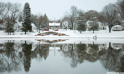
Don't Get Divided Over Symmetry
One of the "rules" of design that you'll see over and over again in books about composition is that you should never divide a frame exactly in half, either vertically or horizontally. The reason for that stodgy old rule is that when you precisely divide a frame in half it tends to take away the dynamic tension in a scene by creating an exact balance of visual space between two halves of the frame (either top/bottom or left right--or both). And a lot of times not dividing a frame in half is a pretty good idea. But as they say, to every rule an exception. I think there are times when perfect symmetry works really well and one of those times is when you have a very strong reflection--as in this winter scene.
I shot the picture here last Friday on the same day I shot the previous winter pond scenes (see the previous postings), but this is a different pond, a few miles from the other one and I went there intentionally looking for a symmetrical subject. Because it's a somewhat long and narrow pond and you can see the entire length of it from almost any spot along the edge, I wanted to shoot a panoramic (and I did) of the hillside and it's reflection. As I was finishing up I saw the man and dog approaching from the right and so I quickly framed a scene that I wanted (I wanted to include that curved stairway--where I spend endless Saturdays hanging around as a kid) and just waited for him to walk into it. He was walking a long leaping stride so I was only able to get off a few quick frames before his shape got lost in the stairway--and I wish I'd shot a half second sooner than I did--but I'm happy with this frame.
Because I had the camera set up for a more or less symmetrical composition before he came along, I just left it that way and I'm glad I did. I kind of like the tension that exists between the reflection and the "real" scene and I even cropped it a bit to make it more closely balanced. While the horizon isn't in the exact middle (you can check in Photoshop by using the ruler tool--Command R on a Mac, no idea what it is in Windows!), if you look closely you'll notice there is just as much space between the top of the tall tree on the left and the top of the frame as there is below it's reflection and the bottom of the frame. I think that that spacing actually emphasizes the idea of symmetry as much as the precise placement of the horizon.
Anyway, I think the scene has a kind of Norman Rockwell appeal to it and I very much like the symmetry between top and bottom--though to be honest, I could probably crop it otherwise and be just as happy. As I said, I think symmetry works particularly well with strong dividing lines like reflections and so next time you're shooting a reflection in a pond or lake (or a puddle, for that matter), don't be afraid to run the horizon right across the center--you may find that, rules or no, that's the best placement.
Labels:
composition,
design,
longbrook,
symmetry,
winter
Subscribe to:
Posts (Atom)