Happy New Year!
Thursday, December 31, 2009
Memory Card Capacity: One Huge Basket or Several Smaller Ones?
Two great things have happened with memory cards in recent years: prices have tumbled and capacity has soared. For example, today you can buy SD (Secure Digital) cards with a capacity of 32 gigabytes--that's enough to store more than 10,000 images from an eight megpixel camera--zowie! And if you shop around you can get some really great deals. The Transcend 16 GB SDHC Class 6 Flash Memory Card TS16GSDHC6is being sold on Amazon for around $42. I can remember the days of paying well over $100 for a one-gigabyte CF (Compact Flash) card. Imagine getting 16x the storage capacity for less than half the price, pretty amazing. And from what I've read, capacity is going to grow even higher.
The question this brings up, however, is just how big a card (or cards) you should use. My personal philosophy is that you're far better off with two or three smaller cards than one giant card. Why? For one, while I've only had one card corrupt on me (out of about 50 cards--and that was years ago), I suppose it is possible. How horrific would it be if your 32 gig card suddenly corrupted two days into a three week trip and you had no backups? I'd sooner have four 8 gig cards and have to change cards (which takes what--five seconds?) a few times during the trip. But more important is the question of losing a card. If you go to Africa on safari and put all of your images on one or two 32 gig cards and you lose one of those cards you've potentially lost (as we learned above) 10,000 pictures. Trust me, at that point you'll be feeding yourself to the lions voluntarily. You might still lose a lot of images even if you lost a smaller-capacity card, but you probably would not lose your entire vacation shoot.
Knowing how much card capacity you need is really a matter of how many megapixels your camera uses and what image-format you are using. If you shoot in jpeg you'll get a lot more images than if you shoot in RAW which is very memory hungry. You'll need a lot more memory if you are shooting RAW and jpeg simultaneously (as I occasionally do)? Also, do you shoot HD video with your DSLR? Video uses a ton of memory. There is a handy little card-capacity chart on the Lexar site (I wish it was bigger and easier to print out, but it's a useful chart) that will tell you how many images you can expect to record based on card size and your camera's megapixel count. I would consult the site of the specific brand of card you're using, too, because the capacity can vary slightly from brand to brand.
The bottom line is that what's true for eggs is also true for digital images: don't put them all in one basket and you'll feel a lot more secure about getting home with those digital eggs intact.
Wednesday, December 30, 2009
Head to the Desert for Winter Wildflowers
By the time that January arrives in New England I've begun to forget what it's like to lay down on the ground to photograph a wildflower in the warm afternoon sun--and that is usually what starts me to start planning a wildflower trip to the desert Southwest. If you've never been to Arizona, Utah, Texas or California or other western states during the early-spring wildflower season, you've missed one of nature's most amazing and whimsical displays. Out of what seems totally barren land, if the conditions are just right, the desert floor turns into a virtual Garden of Eden. It's just incredible to see and it's worth a trip from almost anywhere.
Timing a trip to photograph desert wildflowers is a bit tricky because there is no way to know exactly when the flowers will bloom since it's all entirely dependent on how much rain there was in the fall, how cool or warm the nights were and how much snow has fallen in early winter (yes, there is a lot of snow in the desert!). Different flowers and different deserts come into bloom at different times of year, of course, but usually the displays begin in early February and can last until May. The giant saguaro in southern Arizona, for example, typically don't bloom until late April or early May. In parts of California, however, the bloom period can begin as early as mid January. Desert USA is a great site for tracking the wildflowers' progress and right now they're predicting a good year for 2010. The more flexible your travel dates are the better, but no matter when you go you'll surely find some flowers to photograph. So if you've ever wanted to see and photograph the desert in bloom, perhaps this is the year to give yourself a great travel gift. Who deserves it more than you?
And if you're looking for some inspiration to get you motivated (what, a desert full of wildflowers and vast open spaces isn't enough?) there is a DVD called Season of the Sand Blossoms: A Desert Wildflowers Journeythat takes you on a musical and cinematic journey of the desert Southwest.
Tuesday, December 29, 2009
Architecture: Break Some Rules to Add Drama
Ask any architectural photographer and they'll tell you never to get too close to a tall building with a wide-angle lens because your photos will show an effect called "keystoning" that causes the buildings to lean back in space. But ask them if they ever do exactly that to create drama and the answer will be, "Of course." In most cases (especially if you're shooting photos for the architect) you want to get architecturally-correct views which means either backing away a sufficient distance or, if you're well-heeled equipment-wise, using what's called a perspective-control lens (a lens with a shifting front element that corrects keystoning) to keep the lines of the building square and parallel. But when it comes to creating dramatic photos of buildings, very often it comes down to abandoning technical rules and going with what looks most interesting.
I photographed this view of the Iowa State Capitol, for example, using an 18-70mm zoom at its widest setting (equivalent to about 28mm in 35mm format) from right next to the building. Obviously the building doesn't lean back like this and the columns don't converge, but again, the combination of the wide lens and the close vantage point creates a shot that is technically "wrong" but also quite dramatic. I also shot a number of images with a longer lens from a distance so that the building would look architecturally correct, but they were also complete yawners! The last thing you want people to do when they look at your photos of buildings is to get bored. Next time you find an interesting building, shoot some "straight" images if you have to get it out of your system, but then break some rules and see if you don't like those photos more.
Monday, December 28, 2009
Resolve to Always Edit in the Highest Resolution
If you're like me, very often your image files end up doing double duty: you use a high resolution version for printing (or, in my case, for my books) and another for posting to a blog, website, emails, etc. A lot of times though I'll need the lower resolution versions before I need the high-res files (to post to this blog, for example) and so I do a quick edit in low res first. The problem is that sometimes I get carried away in the low res edit and end up going much farther with the editing than I had planned; I then end up with a perfect edit only to find that I've done all that work on a low res file. Now, of course, I have to go back and try to recreate that nice edit in a high-res version--what a waste of energy! It's so much better and more efficient to do all of your editing in the highest resolution that you'll need (300 dpi if you're planning on printing the images) and then simply dupe that file and create a low-res version. That way both of your files are exactly the same except for the resolution and you only have to edit the image one time.
I can't tell you the number of times (particularly when I first started working digitally) that a publisher found an image on my main site and asked for a high-res file for a book project and I discovered I had never created the higher-res version. If I had had the better quality file ready, submitting it to them would have been a simple emailing job, but instead I ended up having to re-edit to match the low-res version. The image here (that I did edit in high res) took me about an hour to edit because I made selective curves adjustments on several parts of the image and then did selective color adjustments. I'm planning to use the photo in a new book, so fortunately I thought ahead and did my edits at 300 dpi and then just duped it down to 72 dpi (Image>Image Size) for web use. Also, I only put my copyright notice in the low res, so I do that last.
Edit things in the right order and create your master file first and you'll save yourself tons of time and energy.
Saturday, December 26, 2009
Be Aware of Your Camera's Dynamic Range
There is a great deal written (some accurate, some not) about the dynamic range of digital cameras and how this range differs from that of film cameras. I find it interesting and informative to read the varying (sometimes wildly varying) opinions about it, but I usually end up more confused by the end of an hour of reading than I was at the start--largely because the experts tend to disagree pretty emphatically (and if you read some of the online bulletin board exchanges, pretty rudely, too) about just how digital cameras stack up against film cameras in dynamic range.
No one argues about how the dynamic range is actually defined: in very simple terms it's the range between the darkest shadows and the brightest highlights in which the camera can record detail. And it's pretty much accepted that a digital camera's contrast range is narrower than film's (particularly color-negative film); in other words, most experts agree that a good quality color negative film, properly exposed, can record a wider range of tones than a digital camera (also, only when properly exposed). The actual dynamic range of a particular digital camera depends on a lot of factors, including the size and design of your camera's digital sensor. Your camera manual will provide some insight into those particulars. Generally, the larger the sensor your camera has, the wider its dynamic range; which is why a full-frame digital camera--one that has a sensor that's the same size as a frame of 35mm film--usually has a broader dynamic range than a camera with a smaller sensor. (In fact, overall, all aspects of image quality get better with a larger sensor.)
The important thing to remember is that your camera does indeed have a limit to its ability to record contrast and if you try to exceed that range, something is going to give. Not maybe, definitely--either the highlights or the shadows (or both) are going to get lost. How your camera reacts to a very contrasty scene (and which end of the scale it dumps) depends almost entirely on how you expose things. If a scene has very bright highlights and very dark shadows, you can usually (not always) expose to capture one end of the range knowing that you are willingly sacrificing the other. In other words, if you really want to record detail in bright highlights (and normally you should--there are exceptions), then you will have to cut the exposure to bring highlight detail into range. Doing this, however, will cause the shadows to lose all detail. On the other hand, if you set exposure for the shadows, you will gain detail there, but lose most highlight detail. The contrast range never changes for a particular scene at a particular moment, but by altering the exposure, you shift which part of that range you're going to record with detail.
There are times, of course, when the scene will wildly exceed your camera's contrast range and even your ability to only record a portion of that range. In the scene here (shot in the Chincoteague National Wildlife Refuge in Virginia), for example, the presence of specular highlights made it impossible for me to hold the very bright highlights on the water. If I had exposed for them (and theoretically that might be possible), the rest of the scene simply would have gone black or near black. Blehh! Instead, I simply chose to expose the best I could for the grasses and the silhouette of the goose in the foreground and let those super-bright highlights just blow out. Yes, I could have shifted the exposure down a bit, perhaps underexposing by two or more stops from what I shot it at, but then the light airy feeling of the brilliant morning sun would be lost. Detail or not, I liked the way the highlights turned to a wash of specular highlights. Also, since I shot this in RAW format, I could easily have corrected the exposure to a fair degree in editing but chose not to do that.
Two things to keep in mind about dynamic range: One is that camera makers are improving it and stretching it all the time--in a few years, the range is probably going to be extraordinary. Two, in many situations you can use a technique called high-dynamic-range imaging to vastly extend the dynamic range of digital images. I'll talk about the latter technique in a future tip. In the meantime, if you want to read more about it, Ferrell McCollough has written a great book on the topic called Complete Guide to High Dynamic Range Digital Photography (A Lark Photography Book).
Friday, December 25, 2009
Tuesday, December 22, 2009
Consider the Suggestion (Not Rule) of Thirds
It must relate back to some intensely rebellious incident in my childhood (one of a trillion, no doubt), but I've never been very good at following (or even accepting) rules. That's probably why I balk abruptly when I hear anything--even if it's beneficial idea--labeled as a "rule." Still, when it comes to photographic composition, there are some guidelines that can be very useful in speeding up and improving the image-design process and one of those is commonly known as the rule of thirds. I like to think that perhaps the word "rule" is used here to indicate "ruling" (as with a ruler) rather than a "rule" (a convention not to be broken). OK, enough semantics.
You've probably heard or read about the rule of thirds many times and even if you haven't, you've almost certainly invoked it without even knowing it. For many visual artists it's such a natural concept that we use it without even thinking about it. Essentially what the rule suggests (not dictates) is that you divide the frame, both horizontally and vertically, using a set of invisible dividing lines. Using this
design principle will help you establish a more harmonious sense of balance in your images.
If, for example, your divide the frame vertically (see the white division lines) by placing a strong horizontal line at either the lower or upper one-third division, you create a pleasing sense of proportions between the upper and lower halves of the scene. In the sunset here, for instance, by placing the horizon line approximately one third of the way down from the top of the frame, I've created a 2:1 ratio between the lower and upper halves of the scene and the brain perceives this as having stability and balance. The idea of thirds is further reinforced in this shot by placing the small clump of dark land in the foreground at approximately the lower one-third line.
You can also use the intersection of thirds lines as a helpful guide in placing important subject elements, even if there is no particularly strong line present--placing an object in a still life where thirds intersect, for example. In this shot I've put the heavy clump of land at the intersection of the lower one-third and left-vertical third lines and that sets up a nice feeling of balance with the open area of water to its right. In fact, the lower third line seems to run right through the center of the clump of earth.
Would the image fail if I moved either the horizon or that clump of ground to a slightly different position in the frame? No, of course not. Dividing the frame is as much about personal taste and instinct as it is about rigid divisions of the frame. But artists have been using this simple technique for centuries and I think you'll find that when you're searching for just the right balance of objects, spaces and lines, the suggestion (not the rule!) of thirds can be very useful.
Monday, December 21, 2009
Ten Really Last Minute (and Really Inexpensive) Christmas Gifts for Photographers
Ok, well, unless you're living in Dubai or a member of some royal family, I guess the yacht is not on the inexpensive last-minute gift list. But good news, there are lots of fun and inexpensive things that the photographers in your life will love (and thank you for later!). Here are 10 that I am sure anyone would love to get:
- A lens cap. I kid you not, I replace these things about twice a year and it makes me nuts--they're very important for protecting lenses and filters (see the next item) and they get lost a lot. Don't know the size? Just buy them a lens cap at the local store and they can switch it later. Cost: Under $5.
- A UV filter. If someone you know has a DSLR, they can always use another UV filter to keep dust and finger prints off of their expensive lenses. Sneak a look in their camera bag and you'll see the filter size on the current filter. Even if they have the filter already (and lots of people don't), a new one is a great back up or a replacement for a dinged or scratched filter. Cost: Under $15 (depending on size).
- A micro-fiber lens cloth. These are the greatest lens cleaning cloths around. Any camera store will have them and they can be rewashed and used forever. Trust me, this is a wonderful gift. Cost: Under $5.
- An acrylic mirror. Acrylic mirrors are pretty much unbreakable and they are fantastic for bouncing light onto a close-up subject or for lighting up a dark part of a still life. Go to a window/mirror store and look through their scrap bin--all window/mirror stores have a scrap bin of leftover pieces and mistakes. Cost: $2 to $15 (for scraps, depending on size).
- Black or white Foam Core. They'll know what you bought them when you walk in the door probably, but a sheet of white (to use as a reflector) or black (great background for flower close-ups) Foam Core is a really useful and creative gift. You can buy full or half sheets (or scraps) or have them cut to custom sizes. A 24x36" sheet is a good size for nature photography. Cost: around $10-15 (for a full sheet, less for smaller pieces). Want to go wild? They also sell it in cases--check out this site for great prices (under $100 for 25 sheets of 24x36-inch sheets).
- Plastic tool box. Photographers are small gadget collectors and those things fill up a camera bag quickly. But camera bags are expensive and plastic tool boxes work better for things like extra filters, gaffer tape, flash accessories, etc. Look in the tool section at Sears or KMart and you'll find a wide selection. Choose one with a big handle (easier to carry) and a bright color (so they don't forget it in the field). Pros use tool boxes all the time, hobbyists never think of them. Cost: $10-25.
- Hand warmers. Baby, it's cold out there taking pictures in winter! Hand warmers are cheap and man do they work--great to put in pockets or sox, too. They can also be used to keep extra batteries (or an accessory flash with batteries in it) warm and ready to go. Cost: $2 for a small pair, about $25 for a case. Amazon also sells a case of 40 pairs for $23.95 (and they'll ship for free if you have Prime shipping).
- A print of a favorite photo. If you have an inkjet printer sitting next to you, you have a gift-making machine. Instead of elbowing your way through a store, spend a cozy hour at your printer and make some prints for friends. A signed print of one of your best shots is an incredible gift. Cost: cost of paper and ink.
- TrackItBack gift certificate. I wrote about TrackItBack before (their prices have gone up since then, but still pretty reasonable) and they provide an amazing service that can potentially save someone thousands of dollars. You buy a sticker with a unique ID label that goes on a camera (or lens or cell phone, etc.) and if the item is lost, a good Samaritan can return it--shipping paid. It works, too--they have an incredibly high success rate. Cost: one camera sticker, good for life & it's worldwide, $19.95.
- A book on winning digital photo contests! Yes, alright, this is a blatant plug for my new book Winning Digital Photo Contests. The cool thing about this book is that it is illustrated by around 100 amateur photographers from all over the world and the photos (I can say this since they're not my photos) are amazing. Honestly, the most fun part of writing that book was getting to select such interesting and diverse photos. The photos will totally inspire the photographer in your life. Cost: $19.95, but on Amazon, just $13.57. Check the Barnes & Noble site, too.
Thursday, December 17, 2009
Release Stress with a Bit of Abstract Sign Fun
I love to take pictures of lighted signs at night because there is something very visually exciting about that pure and highly saturated color against the dark of night. Another of the fun things about shooting signs is that they are one of the few subjects that really call out to be composed in a completely abstract way. Unless you're photographing a neon sign that makes more sense as a whole (it spells out a classic neon word like "Diner," for example), there is really no reason to even include the entire sign. Instead, look for patterns of light and shapes and colors that have their own visual rhythm. I photographed the sign here at a carnival, for example, and I don't even recall what the sign said--and I don't think I shot a single frame of the complete sign. But I got fascinated by interplay of shapes and colors and the flow of the swirling script.
Normally with night shots (as with any shot) I go to great lengths to get a plain background and to have the pieces of a composition seem organized, but in this shot the random shapes and colors of the carnival flags and pieces of carnival rides in the background just push the scene even farther into the abstract. All the various bits of the shot create a kind of organized clutter that really appeals to me--especially since, again, I'm usually so controlling about the background and simplicity of most of my shots. To be honest, I think I often shoot photos like this to release the tension of keeping such a tight grip on "reality" in most of my photos; letting go and just playing with light and color is very relaxing. Interestingly, when I'm editing an evening shoot, if there are some abstract night signs in the take, I tend to go to those images first, probably because they have a fun and carefree feel to them. It's hard to look at a sign like this and not get a mood lift. In the case of carnival signs, at least, I think that is exactly the atmosphere the sign-making artist was trying to create.
Next time you see an interesting sign at night, try to intentionally avoid shooting the whole sign and instead see if you can find some interesting patterns of shape, line and color. Try holding the camera at weird angles or just zoom in until you barely recognize the subject, you may find that letting go of reality for a few minutes is a welcome (and relaxing) change.
Wednesday, December 16, 2009
Keep an Eye on the Highlight Warning (Or: What Am I Doing in this Two-Bit Clip Joint and What are All of Those Flashing Lights?)
One of the questions that I hear a lot from folks that are new to digital cameras is: "Why do parts of my images flash at me when I'm reviewing photos on the LCD?" The answer is because they have inadvertently turned on the highlight warning or "clipping" warning. Clipping is a term used in digital photography that essentially means the highlights are burned out and that there is no recognizable detail in those areas. Most digital cameras (at least most DSLRs) have a feature that you can turn on or off that flashes to warn you that you have overexposed areas; typically these clipped highlights flash as small dark patches wherever there is a total loss of highlight detail.
But isn't that what the histogram is for? Yes, OK, you can also tell when you have burned out highlights by looking at your histogram for any given shot. On the histogram display what you would see is that part of the graph is butted up against the right side of the display (the right side is the highlight region), but what it won't tell you is where those areas are in the image. The highlight warning provides that information by flashing at you. This is an extremely useful feature because once highlights are blown out, there is very little chance to bring them back. In the photograph of the white ibis shown here, if you look at the top of the head (just above the eyes) you'll see that there is a patch of brilliant white that is missing all detail. I've tried bringing the detail back to that area with a combination of curves controls and highlight masking, but the detail is pretty much lost forever.
So what do you do if you get a clipping warning? The only thing you can do is to use your exposure compensation feature (or, if you're shooting in manual, reduce the exposure by using a smaller aperture or faster shutter speed) to reduce exposure. Yes, this will cause more of your image to shift to the shadow side of the histogram, making everything else proportionately darker, but it's far easier to open up shadow areas than it is to bring back lost highlights. I can bring shadow detail back in even the darkest parts of an image, but with highlights, once they're gone, they're gone. This problem is worse, of course, with subjects like the ibis that are very light in tone (skies are also a problem); clipping is not a problem with midtone objects.
The real question when you see the highlights flashing, however, is whether you really need detail in those areas. In this shot, I would say yes, I wanted detail and because I wasn't paying attention to the warnings, I lost a great shot. Had I paused for a moment to review the clipping, I I would have seen the warning and cut my exposure (possibly even using an accessory flash to compensate, being careful not to overexpose with the flash). But there are times when I've seen a clipping warning and ignored it. If you're shooting a winter landscape and a small unimportant area of white snow is flashing, for instance, you might be able to ignore it. Or if a white sailboat in a harbor is small and unimportant and it's flashing, again, you might decide to let it go.
The key thing about the highlight-warning feature is that it puts you in control of making that decision rather than just reading the bad news from the histogram after you've made your shot. If you suspect some highlights might cause problems, just shoot a test frame and turn on the warning (see your manual for instructions). If there are no warnings or if the clipped areas are not important, keep shooting. If you're getting dazzled by flashing areas, reduce the exposure. The histogram itself is a nice feature because it tells you if you have a lot of areas lost to shadow (left side) or highlights (right side) but again, it takes the highlight warning to show you were those lost highlights are precisely.
Labels:
clipping,
Exposure,
histogram,
specular highlights
Tuesday, December 15, 2009
Step Up to Better Garden Photos
In a previous tip I talked about looking for high vantage points for landscapes and other wide shots, but the idea is just as useful for smaller subjects, particularly garden photos. A few years ago after realizing that I was shooting all of my garden photos from approximately the same height (coincidentally, my eye level), I decided that varying the angle more might add some variety to my shots. I do a lot of garden shots laying on my stomach or my side already, so what was missing was height. I tried some shots with a 6' step ladder and for some shots, particularly wide shots of entire garden beds, that worked fine, but the angle was too steep for closer shots of smaller areas. It looked like a giant had been shooting the photos (though I have shot some photos of my garden from a second-story bedroom window and they look kind of cool).
Next I tried a kitchen stool, just a small white plastic Rubbermaid step stool and it was perfect. Even though it only bought me about another foot of shooting height, the difference in the angle was noticeable and it seemed higher, yet not extreme. Better still, because I was only a foot higher, I was able to use my smaller tripod (a Bogen/Manfrotto 3021). I have a much taller tripod (a Bogen/Manfrotto 3047) but it weighs a lot more and I'm less likely to haul it around the garden. The plastic stool was great and I can throw it in the car for road trips. It makes an excellent platform to get a foot above the crowds at parades or fireworks, etc. Of course, considering the stool only cost about $5 I should probably break down and buy one to keep in the car--I'll have to put it on the next shopping list.
Height is a great thing in composing photos because it provides just enough of a tweak to the composition that people notice the difference without it being an obvious gimmick. Try it!
Monday, December 14, 2009
Please Follow this Blog!
Just a quick interim tip to remind you that you can follow this blog via your Google account. All this really means is that you will see updates from the blog on your Google Dashboard page (to remind you that I'm still out here typing away!). This blog is, and will always be, totally free. I make some small amount (tiny) from clicks on the ads on the blog and if you order something from Amazon and start by clicking one of my Amazon ads (the ads are just a gateway to Amazon, you can order anything in any department--you *don't* even have to be interested in the product that's in the ad), but other than that, I write the tips for the fun of it and because it helps keep me focused. I'm my own therapist (hey, who knows me better?). Anyway, I have a lot of new readers lately and so about once every few months I just ask that readers put me on their follow list. It helps me to know how many people are reading this or if I'm just writing to myself. And don't forget you can always email me or leave a comment requesting certain topics--shooting or Photoshop/editing.
About the photo: I shot this photo of the Statue of Liberty this past summer with a Nikon D90 DSLR and an 24-120mm Nikkor lens (I've grown a bit unhappy with that lens, by the way, it's not as sharp as I'd like and very heavy). As brilliant and blue as the sky is in this shot, the day ended up with an wild thunder storm--it was great. Exposure, in aperture-priority mode, was 1/1000 at f/8.
Sunday, December 13, 2009
Take a Bird's Eye View of Landscapes
Sometimes the best landscape tips are the simplest ones--like looking for a high vantage point. It's amazing how different a scene can look if you can just get above it a bit. I was pretty lucky with this shot of the Camden, Maine harbor because there is a hill next to the harbor--you can pretty much sit on a park bench and get this shot. But I've also shot the same harbor from the back deck of a nearby gift shop (The Smiling Cow, if you happen to be headed up that way) and from the balcony of a hotel. There are also some elevated views of the harbor from a nearby public parking lot. While it's not always possible to find a higher viewpoint, it's worth scouting around a bit. I remember spending a frustrating day trying to get a good shot of the Breakers mansion and its grounds in Newport one summer day and finally decided to go inside and take the tour and wait for an idea to come to me--and it did. During the tour they took us out to a second story portico and from there the entire grounds of the estate and the ocean behind it came into clear view. Duh! It hadn't occurred to me that the best shot of the setting was from the building rather than looking at it. When you're shooting a landscape, look up, and then ask yourself how you can get to a higher perch.
Saturday, December 12, 2009
Pause to Photograph Sacred Spaces
No matter where you live, small town or big city, chances are that some of the greatest artwork in your community exists in the churches, mosques and temples that you drive past every day. Unless you attend religious services on a regular basis, odds are that you pass by these places without ever seeing or thinking about what's inside them. We see the buildings and some are beautiful from the outside, but often even a very modest exterior hides some wonderful works of art--paintings, shrines, altars, stained-glass windows and other very artful objects. Sadly, because of security concerns these buildings aren't as open to the public as they once were, but if you stop by the office and ask for permission to explore, chances are a secretary or someone in the clergy would be happy to let you in and wander around with your camera. If you have confidence in your skills, you might also offer them photos for their website or printed programs in exchange for the chance to shoot.
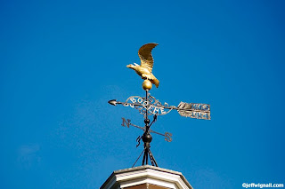
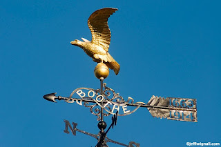
Famous churches and cathedrals, especially in tourist areas, are a lot more likely to be open to the public during regular hours, so before you go on a trip, do some research to find out exactly where they are and when they're open. Be sure also to see if there are any photo restrictions; most don't allow use of tripods or flash, but it varies. I photographed the St. Photios Greek shrine in St. Augustine, Florida (a great vacation town, by the way) and everyone was taking photos. St. Augustine is a very touristy town the and the temple is in a tourist block, so I think photography is encouraged. The shrine is filled with some very pretty Byzantine-style frescoes of many apostles and saints and it's just full of colorful art and decoration. I used a bit of fill-flash to shoot this photo and no one seemed to mind (still, I'd ask someone at the door for permission if you're going to use flash).
I'm sure it would please my mother to know that I stop by churches and temples once in a while--even if it's mostly to take pictures.
Friday, December 11, 2009
Extend Your Telephoto Range with a Converter
If there's one thing (optically speaking) that DSLR photographers always want more of it's a longer telephoto range. Even with the long telephoto lenses available (300mm is common with zoom lenses) and the fact that these lenses are even more powerful on a camera with a cropping factor, there's always a desire to have longer and longer lenses. And for certain types of photography like wildlife and sports, big telephoto lenses are a huge help, no question. It's nice to be able to fill the frame with a songbird across the yard, or a third-baseman across the field.
The problem is that once you get past the 300mm range in a zoom or straight telephoto lens, you're getting into some very expensive pieces of glass. A good quality 600mm lens can set you back around ten grand--yikes! I'd rather put a down payment on a condo in Florida than spend that kind of money on a lens. But there is a relatively inexpensive alternative: telephoto converters. A converter is a tube with glass elements that fits between your existing lens and magnifies the telephoto range of the lens. Typically these converters come in either a 1.4x or 2.0 power (and magnify the focal length accordingly); so with a 300mm lens and a 1.4x converter, you have, in effect, a 420mm lens. No we're rocking! But now add in the 1.5x copping factor that is common on many DSLR camera bodies and you're looking at (or through) a 630mm lens! Fantastic.
The great thing about converters, as I said, is that they only cost a fraction of the price of an equivalent lens. I shot the second of the two photos above with a Kenko Teleplus Pro 2.0 converter on a Nikkor 70-300mm f/5.6 lens set at 230mm (in 35mm terms)--the equivalent of a 460mm lens. How cool to be able to double the focal-length of the lens I was using by slipping a converter onto the camera--it takes literally just a few seconds to do. B&H sells the Kenko converter for around $220.
Are there any drawbacks to converters? Yes. One is that there is some potential degradation of sharpness and the degree really depends on the quality of the converter. To be honest I didn't notice any measurable loss in sharpness with the Kenko--in fact, I found it to be supremely sharp if you lock the camera down on a good tripod. (The photos here are sharper than they look online, by the way, the online compression strongly affects sharpness--never judge the quality of an image by its online reproduction.) There is no way to get a sharp photo with a 460mm lens without a tripod--not going to happen. Some photographers complain about a lack of sharpness with converters but neglect to mention they're trying to handhold enormous lenses. Also, any time you use a longer lens you're going to lose depth of field (it's just an optical fact) and I think some photographers see that lack of DOF as a lack of sharpness--they're not the same thing.
Keep in mind though, the longer the lens you're starting with and the more converter power you add, the more likely you are to see some loss of sharpness. Is the loss a deal breaker? No way. You can more than make up for any softness in editing, again, provided you used a good tripod and a fairly fast shutter speed. If it comes down to not getting the shot or getting shot and having to sharpen it later, I prefer to get the shot.
There is a loss of about a stop of light with all 1.4x teleconverters (about two stops with a 2.0 converter) and that's just part of the price you pay to get a longer lens. It's simple to overcome the loss of a stop if you need it by just doubling the ISO--from 200 to 400 for example--and that buys you back the lost stop. You might notice some slowness of focus with any teleconverter and I do notice that at times, but if you find a good edge to focus on, it's not much of an issue.
Finally, one of the best things about a teleconverter is that it will fit in your jeans pocket. If you're out hiking and you are carrying a 70-210mm or 80-300mm lens, you can double that range with something that fits in your pocket. Yes, you might lose a bit of sharpness and you will lose some light, but when you compare the weight, cost and convenience factors, it's hard to ignore the beauty of a good-quality converter.
Thursday, December 10, 2009
Dig a Little Deeper to Unearth the Gold
For years, one of my hobbies other than photography has been metal detecting or, as it's sometimes called (sarcastically, I think) treasure hunting. Yes, I admit to being one of those geeks that walks along the beach with a $1,000 machine looking for dimes. And trust me, those coins aren't laying on the surface waiting for you to bend over and pop them into your pocket. You spend hours listening for the detector's friendly beep and digging a lot of false hits before you unearth the real deal. It's actually a very fun and interesting hobby and the first time you pull up an old silver coin out of the sand, you feel like running up and down the beach screaming, "I told you so! I told you so!" And I'm sure that some people do. (I just hopped around in a small circle for several minutes grinning and waving the dime.)
Photography is like that too. Even after your treasure-hunting machine (your eyes) spots a potential hot-spot, you have to dig around a bit to find the real buried treasure. I came across this old car at the Marjorie Kinnan Rawlings Historic Park (author of The Yearling) and, being an old car lover, I desperately wanted a picture of it. But the way it was parked in a shelter, half in sun and half in shade, I couldn't find an overall shot that I liked so I abandoned that idea and started digging into the details with my 18-70mm zoom lens. My first shots were of the entire trunk panel and then close-ups of just the old license plate. It was when I turned the camera vertically though that I found a shot that captured both the oldness of the plate and some of the interesting details of the car. As an added bonus, by working a much smaller area I was able to avoid the contrast problems of the very dappled light.
It takes some effort to ferret out the best detail shots sometimes and you get a lot of false hits before you strike gold. But when you do, you might just feel like waving your camera around over your head and hollering, "I told you so, I told you so!" But you might be better off just hopping around in a small circle grinning as you show people your LCD.
Wednesday, December 9, 2009
Minimize Depth of Field for Selective Focus
A lot of depth of field is a great thing if you want everything in your pictures to be in sharp focus. But there are times when you might want to limit or restrict depth of field so that only your main subject is sharply focused and the background and/or foreground is less sharp. The main reason for doing this is to accent your primary subject--in a head-and-shoulders portrait, for example--where you want your subject's face in sharp focus but want to toss the background into a soft blur.
You can reduce the amount of depth of field by simply reversing the things we talked about in the previous tip. Again, here are the primary factors:
Keep in mind, if you're shooting with a point-and-shoot camera, you'll have less control when it comes to restricting depth of field because they tend to have inherently smaller apertures which (you knew this already!) creates more depth of field.
Finally, if you're shooting in bright light and the camera won't allow you to use a wide aperture, even at a high shutter speed, you can use a neutral-density filter in front of the lens to reduce the light. These filters won't affect color but reduce the amount of light entering the lens. I'll write a tip of "ND" filters in the future.
You can reduce the amount of depth of field by simply reversing the things we talked about in the previous tip. Again, here are the primary factors:
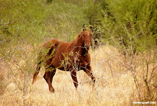
- Lens focal length: The longer the focal length of the lens, the less depth of field you will have at any given aperture (f/stop) and at any given distance. As you zoom a lens from wide to telephoto, for example, you quickly lose depth of field (provided you are keeping the aperture the same, see below). I used a 70-300mm Nikkor AFS lens at the 300mm position (450mm in 35mm terms) to shoot this horse on the King Ranch in Kingsville, Texas partly because I needed the long lens to bring the wild horse close, but also so that I could throw the foreground scrub and background out of focus.
- Lens aperture: The wider the aperture (again, assuming focal length and subject distance are constant) the less depth of field. You will get significantly less depth of field at f/4 than at f/16, for example. Think "smaller" f/stop numbers = larger lens openings = less depth of field. Remember, this does not affect how sharp your subject will be if you focus carefully, the larger aperture only reduces the near-to-far sharpness.
- Subject distance: The closer you are to your main subject, the less that will be in sharp focus in front of and behind the subject. Want less depth of field? Move closer. Want more? Get farther away from your subject.
Keep in mind, if you're shooting with a point-and-shoot camera, you'll have less control when it comes to restricting depth of field because they tend to have inherently smaller apertures which (you knew this already!) creates more depth of field.
Finally, if you're shooting in bright light and the camera won't allow you to use a wide aperture, even at a high shutter speed, you can use a neutral-density filter in front of the lens to reduce the light. These filters won't affect color but reduce the amount of light entering the lens. I'll write a tip of "ND" filters in the future.
Tuesday, December 8, 2009
Maximize Depth of Field for Ultimate Sharpness
There are really two kinds of sharpness in a photograph. One is the sharpness of your main subject, say, a person standing on the beach and that sharpness depends on how steady you were at holding the camera, the shutter speed you used, how carefully you focused on your subject and how still your subject was standing. If you are careful with your technique, your subject should be quite sharply focused.
The other is depth of field or "near-to-far" sharpness and that describes how much of the beach in front of and behind your subject is also in sharp focus. Depth of field sharpness is not an absolute thing that has exact starting and stopping points, rather it's a zone of what is called "acceptable" sharpness. Ultimately how sharp a photo appears also depends on where you're seeing it and how far away you are from the image. If you're looking at an online version it will often look sharper than it will in a print, largely because a print is made of paper and ink and has a surface that can interrupt our interpretation of sharpness. Also, images online are rear-illuminated so they will always look brighter and, within reason, sharper. And if you're looking at a print, the farther you are from the print, the sharper it will appear (particularly if you refuse to wear your reading glasses).
But you can maximize depth of field, that zone of acceptable sharpness, if you know what factors affect it. Basically three things (in combination) determine how much depth of field sharpness an image will have: lens focal length, your distance from the subject and the aperture you're using. Here are some things to keep in mind when you're trying to maximize depth of field:
Of course, there will be times when you want to minimize depth of field--to limit sharpness in a portrait, for example, and to do that...you'll have to read the next tip!
The other is depth of field or "near-to-far" sharpness and that describes how much of the beach in front of and behind your subject is also in sharp focus. Depth of field sharpness is not an absolute thing that has exact starting and stopping points, rather it's a zone of what is called "acceptable" sharpness. Ultimately how sharp a photo appears also depends on where you're seeing it and how far away you are from the image. If you're looking at an online version it will often look sharper than it will in a print, largely because a print is made of paper and ink and has a surface that can interrupt our interpretation of sharpness. Also, images online are rear-illuminated so they will always look brighter and, within reason, sharper. And if you're looking at a print, the farther you are from the print, the sharper it will appear (particularly if you refuse to wear your reading glasses).
But you can maximize depth of field, that zone of acceptable sharpness, if you know what factors affect it. Basically three things (in combination) determine how much depth of field sharpness an image will have: lens focal length, your distance from the subject and the aperture you're using. Here are some things to keep in mind when you're trying to maximize depth of field:
- Wider lenses have inherently more depth of field. That means that for a given f/stop at a fixed lens-to-subject distance, the shorter the focal length of the lens, the more that will be in sharp focus. Wide-angle lenses provide the most depth of field and telephoto lenses the least.
- With any given lens, the smaller the aperture (f/16 as opposed to f/4, for example) the more depth of field you'll get.
- With any given lens at any given f/stop, the farther you are from your subject, the more depth of field you will have. If you were shooting a picture of a friend with a 28mm wide-angle lens at f/8, for example, your photo would have inherently more depth of field if you stood 10 feet away than if you stood five feet awy.
Of course, there will be times when you want to minimize depth of field--to limit sharpness in a portrait, for example, and to do that...you'll have to read the next tip!
Saturday, December 5, 2009
Compose with Odd Numbers (Don't Ask Me Why)
You probably wouldn't think it would matter how many of something you have in a particular photo, but whenever you're composing a group of things, whether it's pears, people, polar bears or pretty much anything else, compositions seem to work best with odd-numbered quantities. None of the composition books I have seems to offer a really solid reason why that's so (file it under "minor mysteries of the human brain"), but I think it's a good rule to follow. Whenever I'm arranging objects in a found still life or composing a landscape (three trees, five horses, etc.), I almost always seem to gather things in groups of three or five. There were about 50 sailboats in the harbor when I took this shot, clustered in little groups, some odd, some even, but the groups that looked best in the viewfinder always had odd numbers in them. Strange, isn't it? I think part of the problem with even-numbered groups is that the eye can easily divide the subjects into pairs and it starts to divide up the frame on some subconscious level. But whenever there are threes or fives, for example, they seem to adhere to one another in a way that unifies them. Try it sometime. Photograph groups of apples on your kitchen table and see if you like the odd groups better than the even ones. And if you figure out why the odds look better, let me know.
Friday, December 4, 2009
Shoot What Interests You
When it comes to deciding if a subject is worth photographing or not, I think a lot of people (including most professionals) run the idea through a mental filter: Is this subject interesting or good enough to spend time photographing? Don't filter yourself. The one criteria you should use in deciding whether or not to photograph something is if it interests you. If something calls you and makes you want to photograph it, don't listen to the critics in your head, just listen to your imagination. These are, after all, your pictures and you get to decide what makes a good photograph. If you critique your ideas too much before you shoot them, you'll only stifle your imagination and give yourself another reason not to haul out the cameras and tripod and make the effort.
I grew up in a suburban part of Connecticut that wasn't far from a much more rural area. Because I didn't spend much time in the rural areas as a kid, I was always fascinated by them. I'm sure if I had grown up on a farm I might not find cows and tractors and old bars quite so fascinating--or maybe I still would, who knows. But farms and farm machinery have loomed large in my imagination since I was a kid and when I got to Iowa the first time a few years ago and saw huge grain elevators with their own private railroad sidings, I was totally intrigued. I spent several days just wandering down dirt roads (look at yesterday's posting for one of those shots) and photographing things like corn cribs, forgotten barns, ratty old farm fences and just about ever silo that I saw.
I shot the photo here in the picture-perfect town of Prairie City, Iowa. In fact, this tractor is sitting in front of a few huge grain silos just a short walk from the town center. By the time I got there the light was beginning to fade (you can see the last splash of daylight on one of the big silos) and a deep shadow had fallen across the tractor. I shot several photos anyway knowing that I could probably save the shot in Photoshop--which is exactly what I did. In fact, getting a decent image from the original file was kind of a challenge (I could write a entire article on the 30 or 40 steps I used to get a good finished file), but because I loved the subject so much, spending time with the image was fun. I just put on some Greg Brown music (he's an Iowa folk singer) and tweaked to my heart's content.
The most important audience you'll ever have for your photography is you. If your photos don't excite you, if the subjects don't stir your imagination, you'll have a hard time inspiring someone else with them. I think the love you have for your subjects and your fascination with them ultimately becomes part of their power. I can't imagine anyone putting "industrial tractor" at the list of their favorite photos subjects, but I think there is a quietness and an intimacy to this shot that others can appreciate. And any time I can document a piece of fading America, I feel that's a worthwhile ambition to serve.
These are the Greg Brown lyrics I was listening to as I edited this image. I'm sure I heard them in my head as I was shooting, too:
Now the railroad came generations ago
And the town grew up as the crops did grow
The crops grew well and the town did too
They say it's dyin now and there ain't a thing we can do
I don't have to read the news
Or hear it on the radio
I see it in the faces of everyone I know
The cost goes up
What we made comes down
What's gonna happen to our little town
"Our Little Town"
Lyric copyright Greg Brown
Thursday, December 3, 2009
Keep a "Places" Journal (And Stop Losing Those Pretty Red Barns)
For a travel photographer, one of the most frustrating things in the world is to find a great photo location and then lose it. I know, because I've done it a lot. The problem is that I like to wander a lot, especially when I'm exploring someplace new, and since I'm concentrating more on things like finding interesting shots, waiting for great lighting and wondering where I'm going to stop and get a burger, I often forget to make notes about exactly where I was when I shot the pictures. A few weeks later I'm back home and editing photos and scratching my head looking at maps trying to piece the trip back together again.
A far better way, of course, is to just keep a notebook handy in your shooting vest or on the dash of your car and keep notes and directions for re-finding locations. I don't go back to the same places all that often, but there are certain pretty places, like this red barn in Iowa, that I would love to shoot again (perhaps in a different season) if I was back in that part of Iowa. I know roughly where I shot it and I can picture the road in my head, but I'm not at all sure I could find it on a map. Had I just written down the route number and the nearest cross street, finding it would be a breeze.
I'm sure that in the next few generations of digital cameras there will be geotagging/GPS included in the EXIF data and keeping a road journal will be a thing of the past, but for now, it's worth writing down where you were when you shot some of your favorite pictures. Besides, while GPS might be a cool techno thing to play with, it's not like you can stuff theme-park brochures or diner menus into it the way you can with a notebook or journal. And if you're going back to the same area to photograph you'll definitely want to remember where the best burgers in town were...though to be honest, I rarely have trouble remembering that.
Wednesday, December 2, 2009
Create a False-Color Infrared Look
Way back in the pre-Photoshop days, photographers who wanted to get experimental with color had to get somewhat inventive in their technqiues. And since many of us grew up in the 1960's and were influenced by artists like Peter Max, we went to some pretty great extremes to intentionally scramble colors. The simplest method was to put colored filters over the lenses, but some photographers got more extreme and tried methods like duplicating negatives and slides (often through many generations) and filtering them during duplication, cross-processing film (developing slides films in chemistry meant for color negative films) or just messing around with colors in the darkroom.
One other option that a lot of us experimented with was a film called Kodak Ektachrome Infrared Film. This film was called a "false color" film because it included a layer that was sensitive to the infrared portion of the spectrum (invisible to humans) and so the way that the film responded and the colors it produced could never be predicted. By using filters over the lens you could further mix up the already off-beat color palette. The colors were wild too: foliage often took on a magenta color, greens became bright yellow and the skies would range from magenta to brilliant pink or yellow/green, depending on what filters you used and what the atmosphere was doing that day. It was a blast. Unfortunately, Kodak stopped making the film a few years ago and unless you have some stored in your freezer, the film is history.
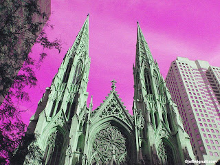
There's a simple way to recreate the false-color look in Photoshop (I'm sure you can do it with other editing programs, too), however, and it's a lot of fun to play with. All that you have to do is open an image and then call up the hue/saturation tool. By sliding the hue to extreme positions, you'll see the colors go through all sorts of wild combinations. That's exactly how I created this shot of St Patrick's Cathedral in New York. Once I had a color shift that I liked, I used the saturation tool to pump up the colors a bit more and then went into the selective color tool and adjusted individual colors (in this case I adjusted the magenta layer to add even more magenta to the sky). As a final step I used the noise filter (Filter>Noise>Add Noise) to add some noise to give the shot a slightly more realistic film look.
For some reason the hue shifting that you can create in Photoshop resembles the Infrared look a great deal and playing with it is kind of like a flashback to the basement darkroom I had during high school. If you'd like to see how pictures shot with the film really looked, take a look at the Flickr Color Infrared Pool. The great thing about experimenting with ideas like this is that there is no right or wrong so you can't make any mistakes and the results are always unexpected and fun.
Tuesday, December 1, 2009
Don't Settle for Your First Impression
Finding a potentially interesting photograph is a pretty exciting moment for most photographers since it's the reason that we own cameras and spend our free time picture hunting. Once you've found a subject with promise, however, it's important that you push past the first flush of attraction and take time to "work" the subject a bit. Refining the shot and looking more closely at what attracted you to a subject really helps to simplify and strengthen compositions.
Often what attracts you to a scene is a clash of color, a particularly interesting bit of lighting or perhaps just a interesting shape or texture. In the case of this bright yellow rope that I found on a dock in Camden, Maine, it was pretty much all of those things: the bright yellow rope, the bright but soft late-afternoon lighting, as well as the shape and texture of the coiled nylon rope. The first few shots I took (top photo) were somewhat predictable: I included the entire coil of rope, as well as some of the dock and the water. I actually left the dock after shooting those first few photos and returned a few minutes, nagged by that voice in my head that tells me I haven't looked hard enough yet.
When I returned to the rope, I began refining the composition by finding a more directly overhead view (which meant leaning out somewhat precariously over the dock from the gangplank I was standing on) and by zooming in more tightly with my 18-70mm Nikkor zoom (a great little lens that came with my D70s kit). By extending the zoom almost all the way (93mm in 35mm equivalent) I was able to crop out all of the excess baggage from the left side and lower parts of the frame. Finally I played with the angle of the dock in the viewfinder until it created that nice diagonal line. I still like the first photo a bit, but I feel the second image is much more graphic and dynamic.
Normally I would shoot this type of scene with a tripod, but because I was hanging out in space somewhat I wasn't able to use one. Fortunately there was enough light to shoot at 1/250 second while still using a relatively small aperture (f/11) to get the depth of field that I wanted. By the way, if you look carefully, you'll notice that the shadow of the cleat (upper right) has become substantially longer and more gentle in the second shot--an indicator of how long I spent trying to find the best shot.
Take time to work the subject and you'll give yourself a lot more options in editing and printing and as I say so often, it's free, so what the heck.
Monday, November 30, 2009
Be a Part of Art: In Memory of Jeanne-Claude
One of the most important ways to develop as an artist, whether art is your hobby, your passion or your profession, is to look at what other artists have done. It's impossible, I think, to be successful in any artistic medium (photography included), unless you know where other artists have taken it in the past. All art has a history and a progression and it's important to immerse yourself in that history whenever you get the chance. Most works of art are created to have a more or less permanent existence and there's hardly a town or a city where you won't find at least one museum to go visit and study and be near great art. But there are also artists who believe that art is best experienced as just that--an experience--and they create artworks that are more temporary in nature.
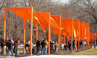
In 2005 a project called the Gates, created by artists Christo and his wife Jeanne-Claude, was put on display in Central Park in New York. It was one of the most ambitious and important art installations in history and millions of people experienced the fun and excitement of walking through endless miles of brilliant orange metal and fabric gates. I was fortunate enough to see the Gates on one of the last days of the installation and it was one of the most inspiring and enthralling art experiences of my life. It was also one of the most fun days I've ever had in New York City. Walking under the flapping bright-orange fabric flags, along with thousands of other art lovers, was a far more emotional and spiritually-exuberant experience than I had expected. Some kind of magic descended on Central Park that I think was shared by almost everyone who went to see the Gates and that magic changed the way we all thought about the park, art and one another.
It took nearly 25 years for Christo and Jeanne-Claude to plan, create and get permission for their incredibly ambitious project and it cost a fortune to produce. They believed in their art though and they had faith in the project that they had devoted so much of their lives to making a reality. And while some critics criticized and made fun of the installation, those people who visited walked around with frozen grins and excited expressions. I'm sure none of them will ever forget the experience of being there.
Sadly, Jeanne-Claude passed away in New York on November 18, 2009. In her life though, she and Christo changed the way the world looks at art and brought smiles and looks of wonder to millions of faces. Jeanne-Claude knew that art, whether "permanent" or temporary, is made to be experienced and to uplift the human spirit and that's why she spent her entire life creating it.
Whether you go to a museum to look at a paintings that are centuries old or take part in a live art happening, seeing art in person is a great way to awaken your imagination and to witness the power of creativity.
Go be a part of art and I guarantee the inspiration will show in your own photos.
Sunday, November 29, 2009
Need a Challenge? Illustrate a Concept
Sometimes the best way to push yourself to be more creative is to give yourself a challenge. One way that many art teachers do that is to have you illustrate a single word or concept, or a particular emotion. The word "quiet," for example, might be illustrated nicely by a person studying in the library, but it could also be illustrated by a harbor scene at sunrise. And while you can't see the wind, you can certainly illustrate the concept of wind--leaves blowing down the street, salt spray blowing off the tops of waves, etc.
Emotions are a great source of photo ideas. Think of the range of emotions that most of us go through in a typical day: happy, sad, pensive, blue, exuberant, excited, victorious, defeated, loved, lonely, etc. If you have young kids around the house you're likely to see this spectrum of emotions on an almost hourly basis and taking pictures of those emotions and moods is a great way to add depth to your family album.
Even if you don't know your subject though, you can often try to imagine the emotions they're feeling and then accent them using the tools of composition, exposure, color palette, etc. To me the photo above perfectly illustrates the concept of the word "alone" or "lonely;" though that is just my interpretation of the scene--there's every possibility that the person in the photo isn't feeling lonely at all. In composing the shot I used a normal lens and a very open framing so that the person standing on the jetty was engulfed in a huge area of sky and sea. I also shot on a somewhat overcast day and late in the afternoon so that the palette of the scene emphasized the solitary nature of the moment.
Interestingly, as I was composing this shot, I heard the lines of John Masefield's poem "Sea "Fever" (my mother's favorite poem) running through my head: "I must down to the seas again, to the lonely sea and the sky..." I'm not sure if I was thinking of the poem first or saw the potential image and that made me think of it, but either way, the word "lonely" was in my head.
What concepts does the photo conjure for you? Peacefulness? Serenity? Loneliness? Memories of summer? Wanderlust?
Challenges push you forward as an artist both visually and emotionally and finding ways to illustrate ideas and concepts is a great way to hone in on your personal vision. And if you have ambitions to sell your photos or become a professional, you'll find that most photographs are assigned, or purchased through stock sources, based on your being able to illustrate concepts rather than come back with photos of specific subjects. The photo here, for instance, could be used to illustrate a financial ad ("When it comes to investing decisions, you're on your own.") or a Hallmark card ("When you're away, the world seems empty."). Merging visuals and emotional concepts is precisely what the advertising world is all about.
Saturday, November 28, 2009
Have Some Fun with Off-Beat Travel Portraits
It's fun to make travel photos more personal by including photos of the people you're traveling with in front of some of the landmarks that you're visiting together. Even if (like me) you prefer to rarely make an appearance in the photos yourself, you'll always be a part of the photos because you shot them. Taking pictures of your travel companions just standing there staring back at the camera can get old pretty fast, however, if you don't find some way to make the experience a bit more interesting for them and you.
One way to change things up a bit and get some interesting photos in the bargain is to use lenses, like ultra-wide-angle lenses, that were never really meant for portrait photography. To take this shot on the steps of Assateague Light in Virginia, for example, I used a Sigma 10-20mm ultra-wide-angle zoom (equivalent to 15 to 30mm on my Nikon D90 camera body) and a very low angle to stretch out both the doorway and my friend and make them both seem much taller than they are in reality. In order to get his very low angle, I had to literally lay down in the sand at the foot of the stairs and shoot nearly straight up. I also used the "live view" feature on the D90 that lets you compose on the LCD--a feature that I rarely use--to make composing the shot easier on my neck.
You can also get some interesting portraits by going the opposite way optically and using a very long telephoto lens to photograph someone in front of an unexpected background. You'll have to shoot from farther away, of course, but the compressed feeling that a long telephotos lens (any lens that is say, the 35mm equivalent of 300mm or longer) creates can be very eye catching. If you were to photograph someone standing on a street corner in Manhattan with a very long lens, for example, the compression would compact the spaces and press your subject into the traffic and crowds behind them. Your subjects will probably find the idea of posing a half block away more interesting too and they will no doubt feel more relaxed by not having to smile into a camera three feet away. (Just don't let them get so far away that they can escape on you.)
Whether you're shooting with a super-wide or super-long lens, take time to pause for a moment and show them the first few frames on the LCD. Once they see how off-beat the photos look they'll be more willing (hopefully) to pose a bit longer and be open to trying some of your extreme portrait ideas later in the trip.
Friday, November 27, 2009
Inspire Someone You Love, Give Them a Book!
Well, OK, since it's "Black Friday" and everyone is talking about holiday shopping , I'll join the chorus and talk about book shopping or, more importantly, book giving (and that includes giving them to yourself). Since I was a kid I've always loved getting books as gifts and since I got seriously interested in photography in my teens, I've loved getting photo books. Fortunately my father was a photographer and my mother loved art and books. My mother also knew how much a single book could change someone's life and bring them the inspiration they needed. She was very good at finding just the right book for me at the right time in my life.
When I was about 15 and going through that typical teenage angst about what my life meant and what I might do for a living someday, my mother gave me Edward Steichen's autobiography A Life in Photography. It literally changed my life. I practically slept with that book (in fact, I probably did fall alseep with it in my bed) and found it enormously comforting and inspiring to read about Steichen's career told in his own words. It was probably no small coincidence that she chose Steichen's book as the first big monograph she bought me because I'd met him as a kid (though I didn't have a clue how important he was at the time). The next year, based on Steichen writing so much about how important Alfred Stieglitz was to him, I asked for (and got) Dorothy Norman's biography of Alfred Stieglitz, An American Seer. Reading that book was such an exhilarating experience for me that I could barely sit still while I read it. Stieglitz was responsible for giving many of the great photographers their first public exposure in his famous "291" gallery and he forever changed the course of photography and art (he was also married to Georgia O'Keeffe, who has always been my favorite artist). Around that same time my mother met Ansel Adams by chance (and talked his ear off, I'm sure) in Yosemite Valley and the next year my parents gave me his amazing book The Camera. It's the best book on camera technique ever written--and it always will be.
It was in reading those books (and many others that I got as gifts) that I discovered that photography was more than a hobby, it was a passion, a way of seeing the world, a way of living--and that photography was as high a form of art as any other. My head was nearly exploding with photographic inspiration in those days and my poor parents probably realized that giving me all of those books wasn't helping their cause in getting me to take up more financially-stable career like being a lawyer or a carpenter or flipping McDonald's burgers, for that matter.
I guess the point is that books can change people's lives. Books still change my life everyday. I love the idea of these new electronic readers like Kindle (from Amazon) and Nook (from Barnes and Noble), but there is no thrill equal to opening the covers of a brand new book and discovering the worlds within. I will always be grateful to my parents for having a houseful of books and for turning me on to the treasures of knowledge, inspiration and adventure that they offered.
If you know someone who has an interest in photography (or any other subject, come to think of it), consider giving them something that will last them a lifetime and might change the way they look at the world (and themselves): a great book. Whether it's a monograph that shares a photographer's life work or a how-to book that helps them develop their own talents, books are an amazing bargain. I've always felt (and this isn't just because I write books for a living--because I buy a lot of books) that if you pay $25 or $50 for a book and get one great life-changing idea from it, you've just got the bargain of a lifetime. I've put a page of Amazon links to photo books on my main site and maybe they'll give you some ideas. But if you really want really want to experience the fun of giving someone a book, spend a few hours in a local bookstore and touch and explore the books yourself--and while you're buying books for other people, maybe you'll buy one for yourself. You deserve it!
Oh, wait, I almost forgot to plug my own new book Winning Digital Photo Contests! Wheww. Glad I remembered. Happy shopping.
Subscribe to:
Posts (Atom)